
Biology. Introduction to the Profession. Task IV (field practice): Data Analysis Using R Script Templates
Although the statistics course is yet to come, the first-year field practice becomes an opportunity to gain initial experience in data analysis...
TASK IV (field practice): Data Analysis Using R Script Templates
|
Trait categories |
The value of this trait expresses... |
Examples |
|
|
Quantitative |
Metric |
...a number from a continuous range that is the result of measurement |
— distance from a plant's growing site to a highway; |
|
Count |
...a whole number that is the result of a particular count |
— the number of plant species in a given plot; |
|
|
Ranked |
...a whole number (rank) that conveys order, not distance |
— assessment of a plot's projective plant cover on a given scale (e.g., 0 — none; 1 — up to 1%; 2 — 1% to 5%; 3 — 5% to 25%; 3 — 25% to 50%; 4 — over 50%); |
|
|
Qualitative |
Multiple |
A certain quality from some set of possible states |
— plot type by a given classification (forest, steppe, meadow...); |
|
Alternative |
One of two possible states (present — absent, right — left, etc.) |
— whether or not the studied plot was burned during the year; |
|
|
Examples of incorrect use of the words “reliability” and “significance” are frequently encountered. The concept of “statistical significance” (or simply “significance”) has a precise mathematical interpretation. The statistical significance of a given result (for example, the detection of a difference between groups of data or of a relationship between two variables) — is the low probability of its random occurrence. The statement “two samples differ statistically significantly” means that the probability of their having been obtained from a single population is so low that their having been obtained from different populations may be considered established. “Reliability” is a much broader concept that may be employed in the most diverse fields (from jurisprudence to philosophy) and has no mathematical definition. It is used to denote well-grounded, evidence-based knowledge. An example of correct application of such concepts is shown in Fig. 1.5.1. |
Значення даної ознаки виражає... |
Examples |
|
|
Incidentally, with poorly designed experiments or errors in interpretation, unjustified conclusions may appeal to a multitude of statistically significant phenomena; significant differences between samples of unreliable facts are of no significance whatsoever… |
Метричні |
...число із безперервного ряду, яке є результатом вимірювання |
— відстань від місцезростання рослини до автомобільної траси; |
|
Рахункові |
...ціле число, яке є результатом певного підрахунку |
— кількість видів рослин на певній ділянці; |
|
|
Рангові |
...ціле число (ранг), що передає порядок, а не відстань |
— оцінка проєктивного покриття ділянки рослинами за певною шкалою (наприклад, 0 — нема; 1 — до 1%; 2 — від 1% до 5%; 3 — від 5% до 25%; 3 — від 25% до 50%; 4 — більше за 50%); |
|
|
(= dichotomous) |
Множинні |
Meristic (discrete, count) |
— тип ділянки за певною класифікацією (ліс, степ, лука...); |
|
Альтернативні |
Один стан з двох можливих (є — нема, правий — лівий тощо) |
— зазнала чи не зазнала досліджувана ділянка пожежі протягом року; |
|
Quantitative Metric (= continuous, measured) ...a number from a continuous series, which is the result of measurement — distance from a plant's location to a motorway; — body weight of a person; — body length of a frog. Count-based (= meristic, discrete) ...a whole number that is the result of a particular count — number of plant species in a given area; — number of points (from 0 to 100) scored by a student in a given course; — number of spots/stripes on the tibia of a frog. Rank (= ordinal) ...a whole number (rank) conveying order, not distance — assessment of the projective cover of an area by plants according to a given scale (e.g. 0 — absent; 1 — up to 1%; 2 — from 1% to 5%; 3 — from 5% to 25%; 3 — from 25% to 50%; 4 — more than 50%); — a student's grade for a given course (A, B, C, D, FX); — rank of finger length on the forelimb of a frog (1 — longest, 2 — next longest, etc.). Qualitative (= attributive) Multiple-state (= nominal, polytomous) A particular quality from some set of possible states — type of area according to a given classification (forest, steppe, meadow...); — student group number (if these groups are equivalent and the number is merely an identifier); — dorsal colour of a frog. Alternative (= dichotomous) One of two possible states (present — absent, right — left, etc.) — whether or not the study area experienced a fire during the year; — biological sex (in the general case, excluding gender) in humans or other animals; — presence or absence of a dorsomedial stripe in a frog. Depending on the category to which the studied traits belong, different study designs should be used, and different statistical methods should be applied to analyse their results. Here we will consider four simple study templates that may involve quantitative (predominantly metric, sometimes meristic) and qualitative (multiple-state or alternative) traits. The most complex category for analysis is rank traits. Unlike qualitative traits, ranks are arranged in a certain ascending order, but unlike meristic traits, the difference between ranks is not a measure of the difference between compared objects. Analysis of rank traits will not be considered in detail here. As students should be aware, statistical methods can be divided into parametric (those that employ certain assumptions about the nature of the distribution of values for the studied traits) and non-parametric (those that do not employ such assumptions). We will use precisely non-parametric methods, which can be applied in a broader range of cases. Template A. Association between two metric traits. A sample in which each element is described by two metric traits. Of the many possible means of statistical analysis, non-parametric Spearman correlation will be used. Example: the association between height and weight in humans. May be supplemented by the calculation of simple linear regression. Template B. Paired comparison by a metric trait. The compared trait is metric, and the one by which categorisation (division into groups) occurs is alternative. The method used is the Wilcoxon test. Example: the length of the right and left arms in a group of people. Two sets of an equal number of measurements, each value in which corresponds to a given value in the other group. Template C. Comparison by a quantitative trait of two or more groups distinguished by a qualitative trait. The compared trait is quantitative, metric or meristic, and the one by which categorisation occurs is qualitative, alternative (in the case of two groups) or multiple-state (in the case of more groups), with no correspondence between individual values from different groups. The method used is the Kruskal-Wallis test. Example: the age of students from four academic groups. Two or more sets of measurements, which may have different numbers of observations. Template D. Contingency table: association between qualitative traits. The compared traits are qualitative (alternative or multiple-state). The method used is the Pearson goodness-of-fit test (chi-squared test). Example of an association between a multiple-state and an alternative trait: elective courses chosen by male and female students; example of an association between two alternative traits: the proportion of smokers among rural and urban residents. General Structure of the Templates R is a scripting language, meaning its "input" is a sequence of commands forming a programme that may be called a script. The script specifies which objects are to be worked with and what operations are to be performed on them. The simplest objects that R can work with are vectors — sequences of values (even a simple number is a vector of unit length in R). Objects in R have a certain type and characteristics and are referred to by their names. In our work it will be necessary to create the required objects (most often vectors) and then apply the appropriate analytical methods (depending on the template) to these vectors. All proposed templates use non-parametric analytical methods that allow calculation of the p-value, the level of statistical significance, and the construction of a diagram that makes it possible to visualise the distribution characteristics of the analysed data. Calculation of Statistical Significance Why is it necessary to calculate p-value? You have conducted a study and compared some groups. Certain differences have been found between these groups, or a certain association has been found between their studied traits... Perhaps this is a simple coincidence, or perhaps it reflects the general patterns we are looking for. How does one choose between these possibilities? To do this, it is customary to formalise two hypotheses. The null hypothesis (H0) asserts that there are no differences between the populations from which the studied groups were obtained (and the observed difference between groups is a consequence of chance in their formation). If an association between traits is being studied, the null hypothesis holds that these traits are not associated, and the observed association between the traits of objects in the studied sample arose by chance during sample formation. The alternative hypothesis (H1) asserts that the differences between groups reflect differences between the populations from which they were obtained, and that the observed association between traits reflects the existence of such an association in all studied objects. The central paradox of statistics is that the researcher works with particular samples, while they are generally interested in properties of all objects belonging to a given category. If the first three people you encounter on the street are women, this does not indicate that there are no men in the city. Can the results of the analysis of a studied sample be extended to the entire population of objects of interest? To determine this, the probability of the null hypothesis, the p-value, is calculated from the results of the analysis. If this probability is low, we have grounds to reject the null hypothesis and accept the alternative! What is the critical threshold? In exploratory biological research, it is conventional to consider that the critical value of the null hypothesis alpha equals 0.05. If p is less than or equal to alpha, we accept the alternative hypothesis; if p is greater than alpha, we have no grounds to reject the null hypothesis and must, until new data are obtained, adhere to the null hypothesis. Creating Vectors In all proposed templates, work begins with creating two vectors containing the values of the traits you are studying that you have recorded. The name of the vector being created should be specified; it is desirable that the name of the vector makes it clear what data it contains. The name of an object in R, including vectors, must be written in Latin characters (exceptions may exist, but it is better to avoid them), without spaces; upper and lower case letters may be used, as well as certain symbols such as . and _, and numbers (except at the beginning of a name). The command that creates a vector is structured as follows. First, specify the name of the vector being created, then the assignment symbol (<-) and the command that forms the vector from a sequence of elements: c(first, second, third). The command c() — necessarily with a Latin letter; if Cyrillic is used, R will report an error! Within the parentheses of this command, list all values in order, separated by commas. The decimal separator for fractional numbers in R is always a full stop. When creating vectors, it is important to maintain the order of values being entered. In a typical logbook organisation for recording research results, the vectors in the provided templates correspond to columns of data. The first values in each vector correspond to the first row, the second to the second row... It is important not to confuse this! After the vectors have been created, they can be viewed in the RStudio window. To do this, it is sufficient to call the name of the vector as a separate command in the script (as done in Template C). This can be useful for checking whether the vectors have been defined correctly. However, it is not mandatory to print them to the console: the created objects can also be viewed using the Environment window (upper right corner of the RStudio window). Adapting the Template Once you have obtained data, you need to edit the proposed templates and insert your own data in place of the sample data provided in the templates. This can be done even with a smartphone (with Google Sheets editing tools and the simplest text editor installed). You can select a column from a table, transfer it to a text editor, separate individual values with commas (and, if necessary, replace decimal separators with full stops), and insert them into the commands that create vectors. In addition, in the templates, the vector names used there should be replaced with your own; the necessary labels for the diagram should be inserted, etc. In each template, those fragments that you need to replace during editing are highlighted in colour. Do not name the traits you use in your study after those named in the template! When a hypothetical Ivan Petrov signs a contract in which the template reads "Person 1", he does not run off to change his passport to the name "Person 1"; he writes his own name in place of the designation of the person that was in the template (sample). Please make the names of vectors and other objects in R informative; fill in the label fields in the diagrams with explanations that will make them comprehensible! Calculating p-value and Constructing the Diagram The edited script text should be pasted into the Script Editor window in RStudio, as shown below. Next, the entire script should be selected and the Run button pressed. RStudio will perform the calculations. All that remains is to understand the results and describe them for your research report! If the p-value is low, R will report the results of its calculation using scientific notation, such as 9.05e-05. The meaning of this notation is: 9.05 x 10^-5. Clearly, in the example given, this value is less than the critical value alpha! Using the Templates The first thing to do to use the proposed templates is to visit the website that provides access to the cloud-based R. Select (Sign Up) the Cloud Free option (it has certain limitations that will not interfere with the planned work). [IMG_1] Registration will be required: provide an e-mail address serving as a login, and create a password. The system will not accept an excessively simple password. [IMG_2] After that, a New RStudio Project should be created. RStudio is a software tool that simplifies working with R. [IMG_3] In RStudio, select the option New File from the File menu, and from there — R script. A window will be created into which the edited script based on the template should be entered. [IMG_4] The edited script should be transferred to the upper right portion of the RStudio window (called the Script Editor). In the example shown, we will use the script from Template A. And here an unexpected pitfall may await inexperienced R users. R demands precision and conformity to rules. For designating text fragments and names in R, straight quotation marks are used: double " and single '. They are straightforward to enter: on the most common keyboard layout they are produced by the key that in the Ukrainian keyboard layout corresponds to the letter Ye (but are entered, of course, in the English layout). Various word processors may replace straight quotation marks with "curly" ones, for example such " or such «». R will not understand these! Look at the following illustration. When transferring the script via the clipboard, the quotation marks were replaced. The quotation marks around the method name (spearman) have been corrected. R highlighted the fragment in quotation marks with colour. But the straight single quotation marks have been replaced by some overly intelligent program with curly ones, which R does not understand and does not highlight. What should be done? Correct them! [IMG_5] In this example, the correct quotation marks are used. Note the syntax highlighting! [IMG_6] Now all rows of the script should be selected and Run pressed (or one can proceed from the first to the last line of the script and execute them using the keyboard shortcut Ctrl+Enter). We can see the result of the script execution. In the console window (Console) — repetition of the executed commands (after the > symbol, highlighted in colour) and the results of their execution; in the diagram window (Plots) — graphical objects constructed according to the commands in the script. [IMG_7] All that remains is the "small matter" of interpreting the results and communicating them to others in one form or another! Template A: Association between Two Metric Traits Features of the script (sequence of R commands). In the example below, two vectors are created, each of eight elements. In both vectors they are arranged in the same order. The command cor.test(First, Second, method = "spearman") specifies for which vectors the correlation test should be performed and defines the method by which it should be calculated. The command plot() constructs a scatter diagram for the analysed data, and the command abline(lm()) adds a regression line to this diagram — the calculated dependence of the values of the second trait on the values of the first. After constructing the diagram, we add the optional part of this template — simple regression analysis (the same one shown as a red line in the diagram). Interpreting the results output by the command summary(LineModel) requires additional explanation. If your study requires such analysis, you will need to consult additional sources. Briefly, it may be noted that in the Call item, the function reports the command according to which the model was constructed. The Residuals block contains data on the distribution of the model's residuals — differences between the values predicted by the model and the actual values. The Coefficients block contains data on the coefficients calculated in the model. In this example, the model takes the form Second = 3.7068 + 0.9038 x First. The Intercept is the constant term of the model, the value of Second when First equals 0. For both the Intercept and the other components of the model, their statistical significance is indicated (in the Pr(>|t|) column). The explanatory power of the model as a whole is assessed by Adjusted R-squared. This is the proportion of the variability of the trait for which the regression model was constructed that can be explained by the model. In this case, this value is 0.587. F-statistic shows the ratio of the unexplained portion of the variability of the modelled variable to the explained portion. The p-value of 0.01623 in our example demonstrates that the model is significant; otherwise, consideration of all other indicators would not be particularly meaningful. First, we present the script text, in which the elements that should be changed according to the results of the student study corresponding to this template are highlighted in colour. First <- c(5.5, 8.2, 7.8, 9.5, 3.3, 8.0, 6.2, 3.5) Second <- c(6.0, 12.1, 12.3, 10.5, 6.2, 11.7, 9.8, 8.05) cor.test(First, Second, method = "spearman") plot(First, Second, xlab = 'Name of the first trait', ylab = 'Name of the second trait') abline(lm(Second ~ First), col = 'red') LineModel <- lm(Second ~ First) summary(LineModel) Now we show what the dialogue with R looks like. StructValue({'language': 'r', 'code': '\r\nFirst <- c(5.5, 8.2, 7.8, 9.5, 3.3, 8.0, 6.2, 3.5)\r\nSecond <- c(6.0, 12.1, 12.3, 10.5, 6.2, 11.7, 9.8, 8.05)\r\ncor.test(First, Second, method = "spearman")'}) StructValue({'language': '', 'code': "\r\n## \r\n## Spearman's rank correlation rho\r\n## \r\n## data: First and Second\r\n## S = 24, p-value = 0.05759\r\n## alternative hypothesis: true rho is not equal to 0\r\n## sample estimates:\r\n## rho \r\n## 0.7142857"}) StructValue({'language': 'r', 'code': "\r\nplot(First, Second, xlab = 'Name of the first trait', ylab = 'Name of the second trait')\r\nabline(lm(Second ~ First), col = 'red')"}) [IMG_8] StructValue({'language': 'r', 'code': '\r\nLineModel <- lm(Second ~ First)\r\nsummary(LineModel)'}) StructValue({'language': '', 'code': "\r\n## \r\n## Call:\r\n## lm(formula = Second ~ First)\r\n## \r\n## Residuals:\r\n## Min 1Q Median 3Q Max \r\n## -2.6775 -0.8150 0.6265 1.0318 1.5439 \r\n## \r\n## Coefficients:\r\n## Estimate Std. Error t value Pr(>|t|) \r\n## (Intercept) 3.7068 1.8679 1.985 0.0944 .\r\n## First 0.9038 0.2731 3.309 0.0162 *\r\n## ---\r\n## Signif. codes: 0 '***' 0.001 '**' 0.01 '*' 0.05 '.' 0.1 ' ' 1\r\n## \r\n## Residual standard error: 1.642 on 6 degrees of freedom\r\n## Multiple R-squared: 0.646, Adjusted R-squared: 0.587 \r\n## F-statistic: 10.95 on 1 and 6 DF, p-value: 0.01623"}) Template B: Paired Comparison by a Metric Trait Features of the script. As in the previous case, the script begins with creating two vectors of equal length. The first values in both vectors correspond to the first object, the second to the second, and so on. However, these values are paired. They are typically measured in the same units, reflect similar properties of objects, but differ with respect to some alternative trait (the size of some structure on the right and left; the value of a given parameter before and after an intervention, etc.). Next, the Wilcoxon test should be applied, specifying that paired values are being analysed. How should a diagram be constructed to reflect the characteristics important for such a comparison? A good solution is to calculate the difference between the two measurements (subtract the second value from the first) and construct a frequency distribution of the values obtained. If the majority of the differences between values in pairs are positive, the values of the first trait are more often greater than those of the second, and vice versa. To visually illustrate this difference, a line marking the value of 0 will be added to the histogram (a diagram showing the frequency distribution falling into different ranges). The script text follows; as in the previous case, the fragments that must be changed when analysing the data obtained by students are highlighted in colour. First <- c(98.20, 42.83, 65.81, 5.76, 57.61, 96.95, 36.99, 54.19, 78.37) Second <- c(98.67, 43.17, 65.64, 6.97, 59.04, 97.48, 37.26, 53.85, 79.35) wilcox.test(First, Second, paired = TRUE) hist(First-Second, xlab = 'Difference between the values of the first and second trait', ylab = 'Number of observations') abline(v=0, lwd = 2, col = 'red') The dialogue with R looks as follows. StructValue({'language': 'r', 'code': '\r\nFirst <- c(98.20, 42.83, 65.81, 5.76, 57.61, 96.95, 36.99, 54.19, 78.37)\r\nSecond <- c(98.67, 43.17, 65.64, 6.97, 59.04, 97.48, 37.26, 53.85, 79.35)\r\nwilcox.test(First, Second, paired = TRUE)'}) StructValue({'language': '', 'code': '\r\n## \r\n## Wilcoxon signed rank exact test\r\n## \r\n## data: First and Second\r\n## V = 4, p-value = 0.02734\r\n## alternative hypothesis: true location shift is not equal to 0'})
First <- c(5.5, 8.2, 7.8, 9.5, 3.3, 8.0, 6.2, 3.5)
Second <- c(6.0, 12.1, 12.3, 10.5, 6.2, 11.7, 9.8, 8.05)
cor.test(First, Second, method = "spearman")
##
##  Spearman's rank correlation rho
##
## data:  First and Second
## S = 24, p-value = 0.05759
## alternative hypothesis: true rho is not equal to 0
## sample estimates:
##       rho
## 0.7142857
plot(First, Second, xlab = 'Назва першої ознаки', ylab = 'Назва другої ознаки')
abline(lm(Second ~ First), col = 'red')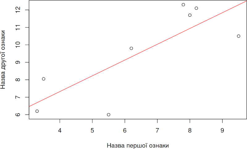
LineModel <- lm(Second ~ First)
summary(LineModel)
##
## Call:
## lm(formula = Second ~ First)
##
## Residuals:
##     Min      1Q  Median      3Q     Max
## -2.6775 -0.8150  0.6265  1.0318  1.5439
##
## Coefficients:
##             Estimate Std. Error t value Pr(>|t|)
## (Intercept)   3.7068     1.8679   1.985   0.0944 .
## First         0.9038     0.2731   3.309   0.0162 *
## ---
## Signif. codes:  0 '***' 0.001 '**' 0.01 '*' 0.05 '.' 0.1 ' ' 1
##
## Residual standard error: 1.642 on 6 degrees of freedom
## Multiple R-squared:  0.646,  Adjusted R-squared:  0.587
## F-statistic: 10.95 on 1 and 6 DF,  p-value: 0.01623
StructValue({'language': 'r', 'code': "\r\nhist(First-Second, xlab = 'Difference between the values of the first and second trait', ylab = 'Number of observations')\r\nabline(v=0, lwd = 2, col = 'red')\r\n"}) [IMG_9] Template C: Comparison by a Quantitative Trait of Two or More Groups Distinguished by a Qualitative Trait Features of the script. As in the two previous cases, the script begins with creating two vectors (exactly two, even if more than two groups are being compared!). One vector contains the values of the quantitative trait by which objects from different groups are compared, and the second contains the values of the grouping variable (such vectors are called factors in R). The Kruskal-Wallis test uses what is known as a "formula", which in this case takes the form (Trait ~ Factor). This should be understood as: the dependence of the values of the variable Trait on the values of the variable Factor. The key result is the p-value, the probability of the null hypothesis, according to which the second variable has no effect on the first. Note: in the type of case being analysed, the effect of one variable on another can be registered for the entire set of groups (in this example — four groups). Even if the effect of the variable Factor on the variable Trait is statistically significant, from this one cannot conclude that, for example, the first group differs significantly from the second. For such conclusions, other comparisons would need to be made, which will not be discussed here (for more detail, see the chapter of the textbook devoted to multiple comparisons). For visualisation of the results, a boxplot ("box and whiskers") will be used. By default, such a diagram shows the distribution of values in each group by quartiles (quarters of the total number of observations). The bold line shows the median — the value that divides the distribution in half. Half of all observations fall within the "box". The "whiskers" extend to the minimum and maximum values in each group (when using, as in the proposed template, the attribute range = 0 in the corresponding command, which disables the interpretation of certain data points as "outliers"). Script text (variable fragments highlighted in colour). Factor <- c(1, 2, 3, 2, 3, 1, 2, 4, 4, 3, 3, 4, 3, 1, 3, 3, 1, 2, 2, 3, 1, 4) Trait <- c(5.7, 8.8, 5.1, 8.2, 8.0, 8.0, 6.5, 6.7, 9.6, 4.9, 1.6, 2.9, 6.8, 4.3, 11.2, 1.9, 4.6, 0.9, 8.8, 6.2, 6.8, 9.4) Factor Trait kruskal.test(Trait ~ Factor) boxplot(split(Trait, Factor), xlab = 'Groups', ylab = 'Analysed metric trait', range = 0) Dialogue with R.
First <- c(98.20, 42.83, 65.81, 5.76, 57.61, 96.95, 36.99, 54.19, 78.37)
Second <- c(98.67, 43.17, 65.64, 6.97, 59.04, 97.48, 37.26, 53.85, 79.35)
wilcox.test(First, Second, paired = TRUE)
##
##  Wilcoxon signed rank exact test
##
## data:  First and Second
## V = 4, p-value = 0.02734
## alternative hypothesis: true location shift is not equal to 0
hist(First-Second, xlab = 'Різниця між значеннями першої та другої ознаки', ylab = 'Кількість спостережень')
abline(v=0, lwd = 2, col = 'red')
StructValue({'language': 'r', 'code': '\r\nFactor <- c(1, 2, 3, 2, 3, 1, 2, 4, 4, 3, 3, 4, 3, 1, 3, 3, 1, 2, 2, 3, 1, 4)\r\nTrait <- c(5.7, 8.8, 5.1, 8.2, 8.0, 8.0, 6.5, 6.7, 9.6, 4.9, 1.6, 2.9, 6.8, 4.3, 11.2, 1.9, 4.6, 0.9, 8.8, 6.2, 6.8, 9.4) \r\nFactor'}) StructValue({'language': '', 'code': '\r\n## [1] 1 2 3 2 3 1 2 4 4 3 3 4 3 1 3 3 1 2 2 3 1 4'}) StructValue({'language': 'r', 'code': '\r\nTrait'}) StructValue({'language': '', 'code': '\r\n## [1] 5.7 8.8 5.1 8.2 8.0 8.0 6.5 6.7 9.6 4.9 1.6 2.9 6.8 4.3 11.2\r\n## [16] 1.9 4.6 0.9 8.8 6.2 6.8 9.4'}) StructValue({'language': 'r', 'code': '\r\nkruskal.test(Trait ~ Factor)'}) StructValue({'language': '', 'code': '\r\n## \r\n## Kruskal-Wallis rank sum test\r\n## \r\n## data: Trait by Factor\r\n## Kruskal-Wallis chi-squared = 1.7645, df = 3, p-value = 0.6227'}) StructValue({'language': 'r', 'code': "\r\nboxplot(split(Trait, Factor), xlab = 'Groups', ylab = 'Analysed metric trait', range = 0)"}) [IMG_10] Template D: Association between Qualitative Traits Features of the script. In this case, qualitative data must be worked with. These data may be coded by numbers or by certain words or, for example, letters. When creating vectors, it should be noted that text fragments must be enclosed in quotation marks. The command that performs the chi-squared test works with matrices or other two-dimensional objects (essentially, various forms of tables) containing the frequencies of different combinations of qualitative traits. We could construct such a matrix directly, but in order for this template not to differ greatly from the preceding ones, we will also create two vectors and then issue a command to construct the required matrix from them. In the example provided, the states of the traits are denoted by words, and for this reason they are enclosed in quotation marks. Based on these vectors, a matrix Frequences of frequencies of different combinations of trait states is created. This matrix must be analysed by the chi-squared method. As in the other examples, we present the script text, with those fragments highlighted in colour that must be changed. FactorOne <- c("green", "black", "green", "yellow", "red","green", "black", "yellow", "black", "black", "red", "black", "black", "yellow", "green", "red", "green") FactorTwo <- c("left", "right", "left", "left", "right", "left", "left", "left", "right", "right", "left", "right", "right", "right", "left", "left", "left") Frequences <- table(FactorOne, FactorTwo) chisq.test(Frequences) mosaicplot(FactorOne ~ FactorTwo, main = "") The dialogue with R looks as follows.
Factor <- c(1, 2, 3, 2, 3, 1, 2, 4, 4, 3, 3, 4, 3, 1, 3, 3, 1, 2, 2, 3, 1, 4)
Trait <- c(5.7, 8.8, 5.1, 8.2, 8.0, 8.0, 6.5, 6.7, 9.6, 4.9, 1.6, 2.9, 6.8, 4.3, 11.2, 1.9, 4.6, 0.9, 8.8, 6.2, 6.8, 9.4)
Factor
## [1] 1 2 3 2 3 1 2 4 4 3 3 4 3 1 3 3 1 2 2 3 1 4
Trait
##  [1]  5.7  8.8  5.1  8.2  8.0  8.0  6.5  6.7  9.6  4.9  1.6  2.9  6.8  4.3 11.2
## [16]  1.9  4.6  0.9  8.8  6.2  6.8  9.4
kruskal.test(Trait ~ Factor)
##
##  Kruskal-Wallis rank sum test
##
## data:  Trait by Factor
## Kruskal-Wallis chi-squared = 1.7645, df = 3, p-value = 0.6227
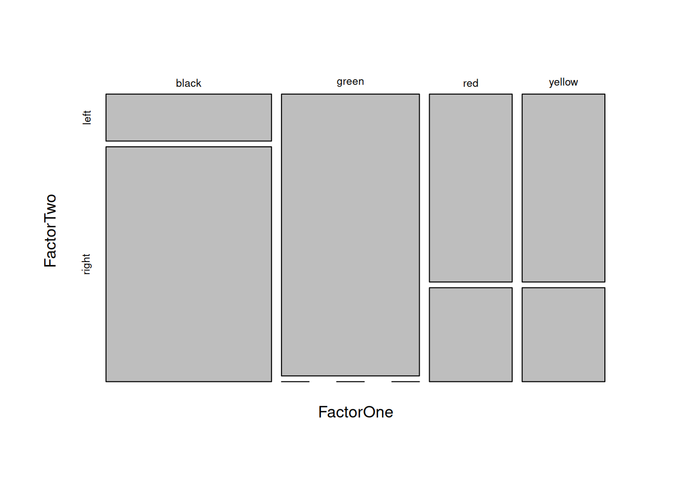
boxplot(split(Trait, Factor), xlab = 'Групи', ylab = 'Аналізована метрична ознака', range = 0)StructValue({'language': 'r', 'code': '\r\nFactorOne <- c("green", "black", "green", "yellow", "red","green", "black", "yellow", "black", "black", "red", "black", "black", "yellow", "green", "red", "green")\r\nFactorTwo <- c("left", "right", "left", "left", "right", "left", "left", "left", "right", "right", "left", "right", "right", "right", "left", "left", "left")\r\nFrequences <- table(FactorOne, FactorTwo)\r\nchisq.test(Frequences)'}) StructValue({'language': '', 'code': '\r\n## Warning in chisq.test(Frequences): Chi-squared approximation may be incorrect'}) StructValue({'language': '', 'code': "\r\n## \r\n## Pearson's Chi-squared test\r\n## \r\n## data: Frequences\r\n## X-squared = 8.0548, df = 3, p-value = 0.04489"}) StructValue({'language': 'r', 'code': '\r\nmosaicplot(FactorOne ~ FactorTwo, main = "")'}) [IMG_11]
FactorOne <- c("green", "black", "green", "yellow", "red","green", "black", "yellow", "black", "black", "red", "black", "black", "yellow", "green", "red", "green")
FactorTwo <- c("left", "right", "left", "left", "right", "left", "left", "left", "right", "right", "left", "right", "right", "right", "left", "left", "left")
Frequences <- table(FactorOne, FactorTwo)
chisq.test(Frequences)
## Warning in chisq.test(Frequences): Chi-squared approximation may be incorrect
##
##  Pearson's Chi-squared test
##
## data:  Frequences
## X-squared = 8.0548, df = 3, p-value = 0.04489
mosaicplot(FactorOne ~ FactorTwo, main = "")