StatOracle–05(S) Data Visualization in Statistica
The first (and sometimes — even the only one, since it provides answers to all questions) result of data analysis — is the construction of graphs, visualization of results. Here the data visualization in Statistica is explained using an example of a file with real data obtained during the description of the diversity of green frogs (P...
Topic 5. Data visualization in Statistica
5.1. Histograms in Statistica: example of building graphs
You begin exploring data in a certain file... What step should be first? Most often — visualization, building graphs. Let’s consider it, starting with the simplest type of graph: histograms. They are called from the Grafs (Graphics) menu, and are located there both at the very top of the list and can be called from deeper menus.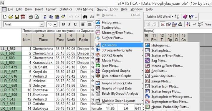
Fig. 5.1.1. The histogram building mode can be invoked directly from the “Graphics” menu or from the submenu of two‑dimensional graphs (2D Graphs), which provides a wider choice of options
Histograms show the frequencies of objects belonging to different classes in the form of columns. For example, a significant feature by which the frogs described in the file can be grouped is their genotype. Let’s build the distribution of frogs by genotype. Following the path Grafs / Histograms … (Graphics / Histograms …) or, equivalently, Grafs / 2D Grafs / Histograms …, we arrive at a “quick” histogram building dialog.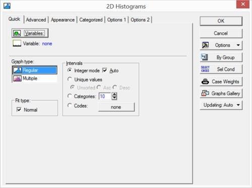
Fig. 5.1.2. Quick histogram building dialog
Clicking the Variables button, select the variable Genotype. In this tab you can also select several variables (and, in the simplest case, build several graphs simultaneously). To select variables that are not adjacent, hold the Ctrl key while selecting. The flag next to the Fit type: Normal box will add a normal distribution curve to the graph (best fitting the existing data). In this case it is not needed, so the flag should be cleared. Also clear the flag in the Auto box, which provides automatic binning of the Genotype variable (although in this case it will not affect the result: this variable takes only the values 1, 2, 3, 4 and 5).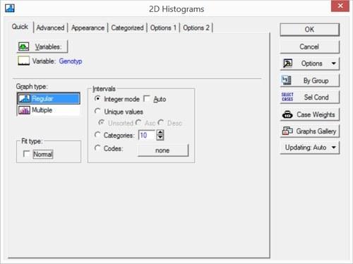
Fig. 5.1.3. Quick histogram building dialog: necessary corrections made
The Advanced tab provides broader possibilities for controlling histogram properties.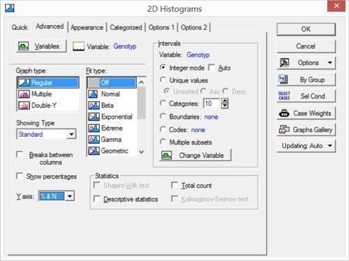
Fig. 5.1.4. “Advanced” tab in the histogram building dialog
Let’s change the Y‑axis display mode: set the option “% & N” to see the distribution of frogs by genotype not only in counts but also as a percentage of the total. Press “OK” to obtain the result.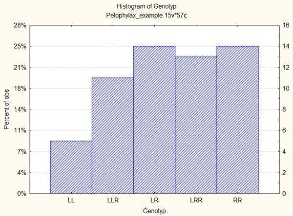
Fig. 5.1.5. Distribution of frogs from the file Pelophylax_example.sta by genotype
Another important characteristic of the material is sex. Can we build a corresponding graph only for females? For this, click the Select Cases (Sel Cond) button. In Fig. 5.1.4 it is visible in the middle of the right button row.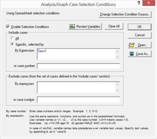
Fig. 5.1.6. Select Cases dialog (Observation selection)
Immediately after opening this window most of its controls are disabled for editing; to enable them, check the Enable Selection Condition box. If, during any analysis, the user does not notice that the “Select Cases” button is engaged, they will not realize that they are working with only a part of their data set. The next figure shows the statistical processing method selection window in Basic Statistic and Tables mode; it can be assumed that after building graphs the user proceeded to the actual statistical processing. If the user ignores that the “Select Cases” button is pressed, part of the results present in the file may become unavailable. Unfortunately, this is a common source of errors when working with Statistica.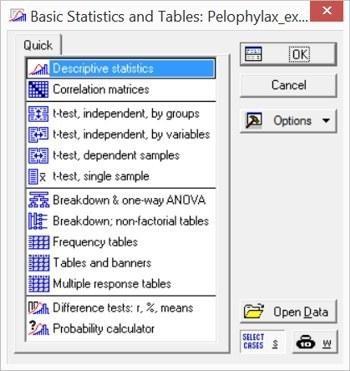
Fig. 5.1.7. Attention! “Select Cases” button is pressed! If these selection conditions remained active after previous actions with Statistica, part of the data may become unavailable for processing!
Selection conditions can be set in several ways. One can enter inclusion conditions (the rows for which the condition holds will be analyzed, all others will not). Conversely, one can enter exclusion conditions. Finally, observations to be included or excluded can be listed explicitly. When formulating conditions, variable names or their ordinal numbers may be used; the logical functions and and or are allowed, as well as parentheses. For example, the condition “Basin = 2 and v5 = 1 and (v7 = 3 or v7 = 4)” in the file Pelophylax_example.sta corresponds to a single individual.
Thus, by specifying Sex = 1 we will build a histogram only for females. In addition, check the Breaks between columns box on the Advanced tab so that the columns do not merge.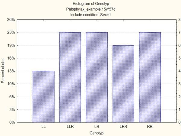
Fig. 5.1.8. This histogram shows only female frogs
To see the male distribution, one can build another histogram, or combine data for females and males on one graph. For this, use Categorized Histograms from the Categorized Grafs menu.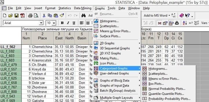
Fig. 5.1.9. Categorized Grafs is a separate group in the Grafs (Graphics) menu
When selecting variables for categorized histograms, you need to choose not only the variable whose categories will be shown as columns, but also the categorizing variable.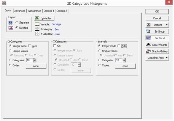
Fig. 5.1.10. Setting parameters for categorized histograms. Note the Layout switch: Separate or Overlaid
When Layout is set to Overlaid, differences by the categorizing variable are displayed on the categorized graphs with different symbol styles. Two categorizing variables can be chosen, but in most cases such graphs become overloaded and are difficult to interpret.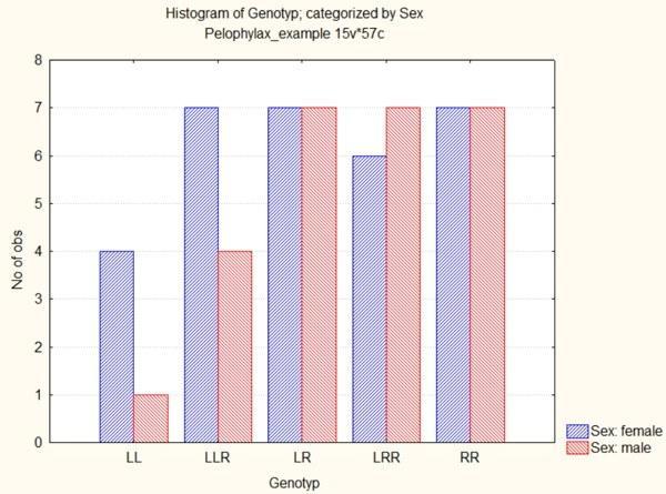
Fig. 5.1.11. Categorized histogram: males and females shown as separate columns highlighted by colour
5.2. Editing a graph in Statistica
The categorized histogram obtained in the previous section allows a quick assessment of sample size and composition. However, this graph has several significant drawbacks.
For example, in collective unconscious the colour blue is associated with the male sex, and red or pink with the female (hence blue blankets for baby boys and red for girls). In the previous graph females are shown in blue, males in red. Even if we do not endorse outdated gender stereotypes, we may encounter that the graph is perceived more easily if we change the colours representing the sexes.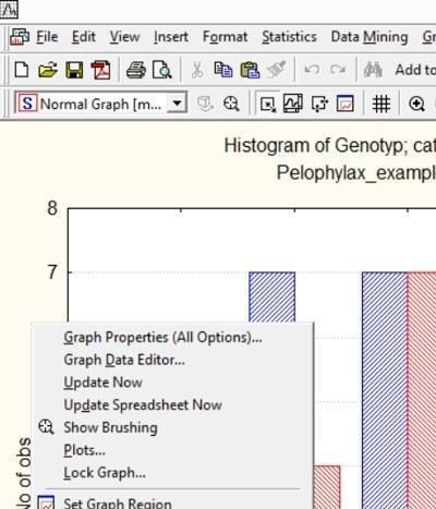
Fig. 5.2.1. Right‑clicking in the area next to the graph opens a context menu; one of its options, Graph Properties (All Options) …, allows extensive modification of its properties
Colors of graph elements, as well as many other features, can be changed via the graph properties editor. To open it, right‑click in the graph area (outside the actual plot) and choose Graph Properties (All Options) …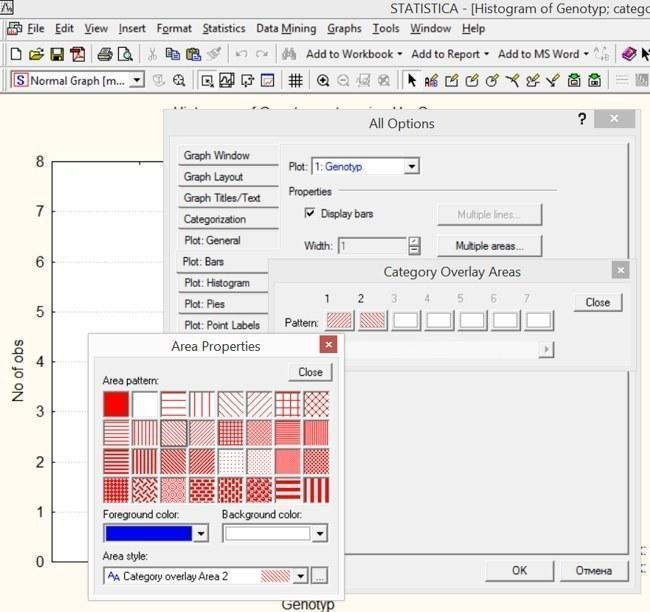
Fig. 5.2.2. In the All Options window on the Plot: Bars tab click the Multiple areas button. A list of column styles appears. Clicking any of them changes its fill pattern and colour. The illustration shows the stage where the first column has already been made red, and the second column’s colour is being changed to blue...
This mode contains many tabs. In our case we need to edit column properties. In the corresponding dialog one can change the colour of the main pattern, background and fill style. If, using the discussed program, one needs a graph for black‑and‑white printing, all colour variety should be removed and differences conveyed only by hatching, shape, line texture, etc.
In different versions of Statistica the placement of buttons on the All Options tab varies. Beginners can be encouraged to experiment with various buttons and modes to discover which functions are available.
Statistica graphs have their own “.stg” format. Most other programs cannot read this format. However, most Windows programs can work with “.wmf” (Windows Metafile). Saving a graph first in “.stg” (so it can be reopened and edited later in Statistica) and then in “.wmf” allows insertion into Microsoft Word or other text editors, as well as CorelDraw and other vector graphics programs. Of course, most Windows applications also support simple copy‑paste of Statistica graphs and table fragments via the clipboard.
When saved as “.wmf”, each graphic element is stored separately. Dashed lines that indicate levels on graphs become a collection of many points or segments, which can be processed by programs such as CorelDraw very slowly. Therefore it sometimes makes sense to convert dashed lines to solid ones. To do this, double‑click the line, double‑click the Gridlines … button and set the required line parameters.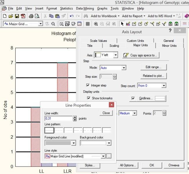
Fig. 5.2.3. After double‑clicking the Gridlines … button, line parameters become available, displayed by default in italics
Although for the current graph there is no urgent need for such a change, one can adjust the axis scale ranges and the spacing between grid lines. To change the interval between axis tick marks, use the Scaling or Major Units tabs. To edit the spacing between grid lines, select Manual in the Mode window. Suppose we choose a step of 3 units.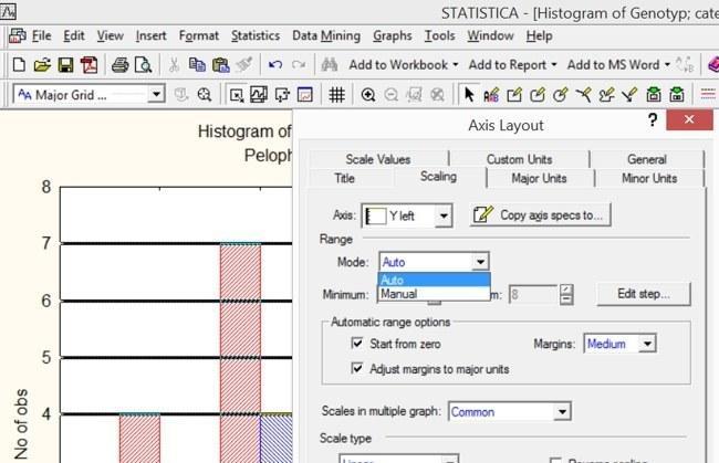
Fig. 5.2.4. Switching the mode from “Auto” to “Manual” in this window allows setting the start and end values of the scale displayed on the graph
In the manual‑mode tab set the scale minimum to 0 and the maximum to 9. In the Edit step… window one can also switch to manual mode and set the distance between lines to 3 units.
Double‑clicking the axis label, graph title or legend opens the editing mode for these elements. Here a more appropriate title can be given to the graph. Double‑clicking the axis name allows changing it as well.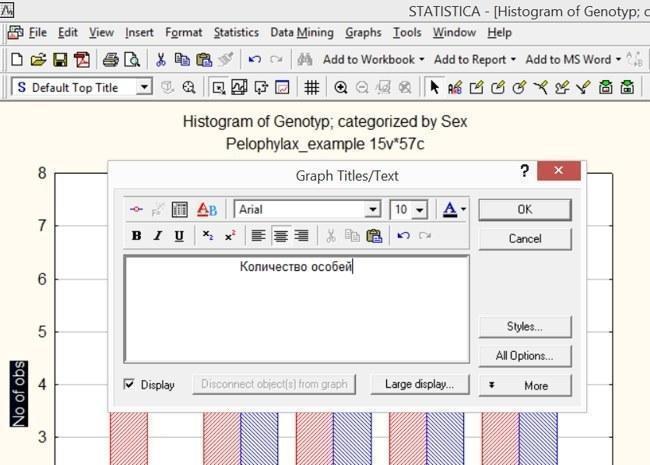
Fig. 5.2.5. For clear perception, axes should be labeled clearly and correctly 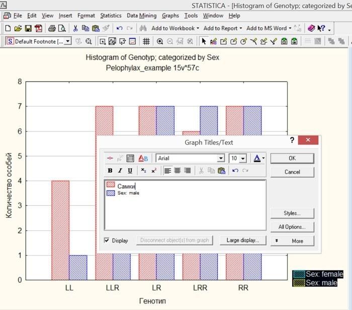
Fig. 5.2.6. Editing the “legend” (list of symbolic graph markings) 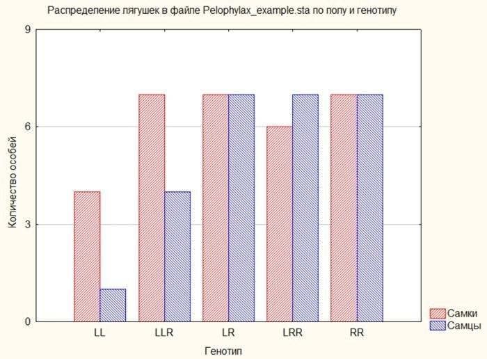
Fig. 5.2.7. Result of the graph revisions shown in the previous illustrations
5.3. Scatterplots and regression lines in Statistica
Isn’t the most powerful way to build graphs in Statistica the scatterplot? Invoking the dialog for their construction is very simple: Graphs / Scatterplots or Graphs / 2D Graphs / Scatterplots. A whole series of techniques for working with such graphs has already been discussed in the histogram section. Let’s start simple: we will plot head width versus body length of frogs. For this, display the variable L on the X‑axis and the variable Ltc on the Y‑axis.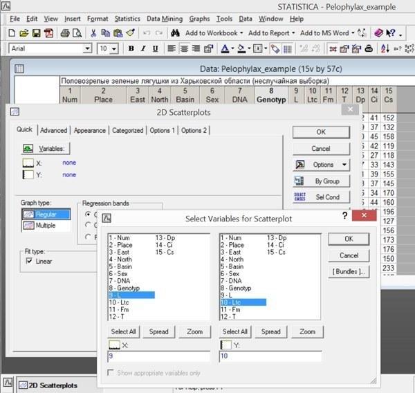
Fig. 5.3.1. Building a plot of head width dependence on body length
Note: the graph title will contain the regression equation describing the used point set.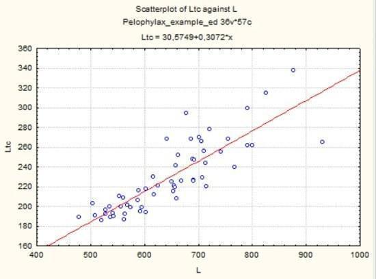
Fig. 5.3.2. Graph built according to the conditions shown in the previous figure
The concept of “regression” was introduced by Francis Galton, the founder of biometrics, at the end of the 19th century. A functional relationship describes a unique link of one quantity to another; for example, the weight of a sphere of given density is a function of its size. Regression describes a statistical relationship. Human weight depends on height, but also on many other factors. The relationship of height to weight is not a function but a regression. Regression is the dependence of the mean value of one variable on another (or others).
When constructing a scatterplot, a certain set of points is considered. The user specifies the type of function that describes the relationship of the mean values of the examined variables. Note: in Fig. 5.3.1 the Fit type: Linear box (on the right side of the dialog) is checked. With such settings the program determines linear coefficients that best approximate the available data set. Approximation is a close fit; to approximate is to describe roughly; to replace an unknown relationship (regression) with its most suitable approximation.
As seen in Fig. 5.3.2, the graph shows the relationship Ltc = 30.6 + 0.3 * L (x‑axis corresponds to variable L). This function corresponds to a linear relationship: y = a + b * x. On the Advanced tab other functions for approximating the relationship can be selected, as reflected in the mutual arrangement of points on the graph.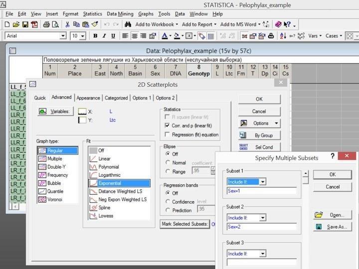
Fig. 5.3.3. Some options of the Advanced tab in the scatterplot building dialog
Notice the Advanced tab options shown in Fig. 5.3.3. The fitting function chosen for approximating the relationship between variables on the existing point set is Exponential, y = a * eˣ, where e is the base of natural logarithms. In the Statistics window the checkmark next to Corr. and p (linear fit) is set — the correlation coefficient and its statistical significance level (for linear dependence). In the Mark Selected Subsets window special symbols are indicated for females (Sex = 1) and males (Sex = 2).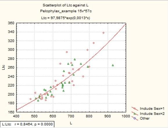
Fig. 5.3.4. Graph built according to the conditions shown in the previous illustration
As you can see, a corner inset now displays the Pearson correlation coefficient (r) and its significance level (p).
Compare the result in Fig. 5.3.4 with the next one, built using a categorized scatterplot (Graphs / Categorized Graphs / Scatterplots) in Overlaid mode.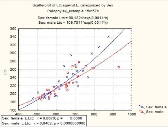
Fig. 5.3.5. Categorized scatterplot: two regression lines instead of one
As you can verify, the difference is that in Mark Selected Subsets mode all calculations (both regression lines and correlations) are performed for the whole set, with the two sexes merely marked by different symbols, whereas in the categorized scatterplot all calculations are performed separately for each sex. Which variant better suits your task is up to you.