StatOracle–06 Data Visualization Using Base R Graphics
One of the reasons for R’s popularity is the wide range of data visualization capabilities this language provides
6 Data Visualization Using Standard R Tools 6.1 Most Common Chart Types Data visualization is a crucial part of almost any statistical analysis. The reason is that a correctly constructed chart allows you to grasp the most important analysis results at a glance. However, creating such a chart is often a complex task. Results should be presented in a way that is maximally understandable. To achieve this, the best of many possible chart types should be chosen. There seems to be no universally accepted classification of charts. We will use the terms as follows. Chart (English: diagram, from Greek: διάγραμμα — image) is the broadest term. It is a type of scientific graphics, an image that visually demonstrates the relationship or dependence between certain quantities using specific symbols. The most common types of charts are: — scatter plots: display of a set of values of two variables in Cartesian (rectangular) coordinates as a set of points; — line charts (line graph): a way to visualize the dependence between different variables using lines (e.g., function graphs; graphs of changes in a certain quantity over time); — bar charts (bar graph, bar plot): demonstration of the relationship between different quantities using bars or lines; — pie charts: demonstration of the relationship between different quantities by dividing a circle into sectors; — histograms: demonstration of the distribution of a certain quantity by dividing it into separate ranges (bins); usually differs from a bar chart by the absence of gaps between individual bars; — kernel density plots, including violin plots: demonstration of the distribution of a certain quantity or comparison of distributions of certain quantities through the probability density of values, calculated by smoothing the available data; — box plots (box-and-whisker plot): demonstration of the distribution of a certain quantity, or, more often, comparison of distributions of certain quantities; they most often display these distributions by reflecting quartiles; — cartograms, density maps: a way to demonstrate the distribution of a certain indicator across geographical space; constructed based on a geographical map. The list of chart types provided does not exhaust their diversity, which can be encountered even within this course. 6.2 Colors in R Colors are an important tool for creating visualizations. Various color coding options can be used in R. In our opinion, using color names provided in R is the most convenient. The provided color names are shown in Fig. 6.2.1; clicking on the image with the mouse will bring up a magnified copy, which will be much easier to read. Fig. 6.2.1. List of color names usable in R (clickable!) 6.3 Scatter Plots We will create different types of charts using the tools included in base R. We will experiment with the PelophylaxExamples dataset. First, let's create the file we will work with. Among other things, we will increase the number of columns in this dataset: we will calculate the relative sizes of the metric features we used. To do this, we will divide the absolute values of the metric features by the body length.
# setwd ...
PE <- read.csv('PelophylaxExamples.csv', sep = ";", dec = ",")
PE$Ltc_Lc <- PE$Ltc / PE$Lc
PE$Fm_Lc <- PE$Fm / PE$Lc
PE$Ti_Lc <- PE$Ti / PE$Lc
PE$Dp_Lc <- PE$Dp / PE$Lc
PE$Ci_Lc <- PE$Ci / PE$Lc
PE$Cs_Lc <- PE$Cs / PE$Lc
save(PE, file = "PelophylaxExamples.RData")
load("PelophylaxExamples.RData")
# attach(PE)
The last line, attach(PE), could somewhat simplify subsequent commands. This command adds the specified object to the path where R searches for received commands. Let's explain this with an example of creating a scatter plot. The standard R tool for creating such plots is the plot() function. Depending on the arguments specified for this function, it determines which plot to build. For example, if two vectors are passed to this function (these can be two columns of a specific matrix or data table), this function will build a scatter plot. If the command attach(PE) was not executed, the command plot(Fm, Ti) will result in an error message. To create such a plot, a command must be provided that specifies where exactly the vectors of interest are located. We will provide two ways to do this. They should lead to identical results.
plot(PE$Fm, PE$Ti)Fig. 6.3.1. Result of executing the command plot(PE$Fm, PE$Ti)
plot(PE[, "Fm"], PE[, "Ti"])Fig. 6.3.2. Result of executing the command plot(PE[, "Fm"], PE[, "Ti"]) The difference between the obtained results only concerns the axis labels (as we labeled them in the command, so they will be labeled). Of course, this problem can be solved radically - by specifying in a separate attribute of the command how the axes should be labeled. We will show this with an example where, after executing the attach(PE) command, vectors can be labeled more simply, and we will also use a name for the entire diagram.
attach(PE)
plot(Fm, Ti, xlab = "Довжина стегна, мм", ylab = "Довжина гомілки, мм", main = "Залежність довжини гомілки від довжини стегна")Fig. 6.3.3. A diagram with a general title and labeled axes is perceived much better How to make this diagram more expressive? There are many ways, some of which relate purely to design. For example, you can use different symbols, different colors, different sizes. For instance, the pch = attribute allows you to choose the symbol used to mark points, col = is the color of these symbols, and cex = is their size. The decoding of pch = values is shown in Fig. 6.3.4. Fig. 6.3.4. Encoding of symbols used in R diagrams
plot(Fm, Ti, pch = 20, cex = 0.8, xlab = "Довжина стегна, мм", ylab = "Довжина гомілки, мм", main = "Залежність довжини гомілки від довжини стегна")Fig. 6.3.5. Different symbols are used here. We will use the color of the symbols not as a decorative element of the diagram, but give it semantic meaning. We will mark females and males with different colors. To do this, we need to specify which points correspond to females and which to males. We will create a separate vector for this purpose.
SexColors <- c("red", "blue")[factor(Sex)]
SexColors
##  [1] "red"  "red"  "red"  "blue" "red"  "red"  "blue" "red"  "blue" "red"
## [11] "blue" "blue" "red"  "red"  "red"  "red"  "blue" "red"  "blue" "red"
## [21] "red"  "blue" "blue" "red"  "blue" "red"  "blue" "blue" "red"  "red"
## [31] "blue" "blue" "blue" "red"  "blue" "red"  "red"  "red"  "blue" "blue"
## [41] "red"  "red"  "blue" "blue" "blue" "red"  "red"  "red"  "red"  "blue"
## [51] "red"  "red"  "red"  "blue" "blue" "blue" "blue"
In addition, we will give meaning to the size of the symbols. Let them reflect the size of the individual. The symbol size cex = Lc/50 is chosen so that they fit normally on the diagram.
plot(Fm, Ti, col = SexColors, cex = Lc/50, xlab = "Довжина стегна, мм", ylab = "Довжина гомілки, мм", main = "Залежність довжини гомілки від довжини стегна")Fig. 6.3.6. The scatter plot has become much more informative. The resulting scatter plot requires additional explanations. We will use a legend.
plot(Fm, Ti,
     col = SexColors,
     cex = Lc/50,
     xlab = "Довжина стегна, мм",
     ylab = "Довжина гомілки, мм",
     main = "Залежність довжини гомілки від довжини стегна")
text(30, 26, "Розмір кола є пропорційним довжині тіла жаби", adj = c(0,0))
legend(25, 43, title = "Кодування статей:", c("самиці", "самці"), col =  c("red", "blue"), pch = c(1, 1))
Fig. 6.3.7. The necessary explanations are provided by the legend (decoding of symbols) and textual explanations on the diagram. In fact, all parameters of the diagram can be adjusted; you can read about this, for example, in the help file, which can be called by the command ?plot . 6.4 Scatter plot matrices An interesting option for getting acquainted with the data is to use scatter plot matrices. This can be done using the pairs() function. The tilde ( ~ ) used in the formula below is a symbol used in R commands to demonstrate the dependencies of certain quantities.
pairs(~ Lc + Ltc + Fm + Dp, data = PE)Fig. 6.4.1. This type of diagram can be very useful for getting acquainted with the data. The matrix shown has two symmetrical parts. You can display only one of the two halves on the diagram and show a regression line in each individual cell.
pairs(~ Lc + Ltc + Fm + Dp, data = PE, lower.panel=NULL, panel = panel.smooth)Fig. 6.4.2. Our scatter plot matrix looks better. Logically, the attribute upper.panel=NULL will result in only the data located below the main diagonal being shown. 6.5 Line plots (line graphs) By default, if the plot() function receives two vectors as input, it builds a scatter plot, placing symbols on the coordinate plane. But this is not the only possible option; the type of data display is determined by the type = parameter: "p" – points (used by default); "l" – lines; "b" – both points and lines; "o" – points over lines; "h" – histogram-like bars; "s" – step curve; "n" – data is not displayed (no points). What will happen if we specify, for example, type = "l"?
plot(Fm, Ti, type = "l")Fig. 6.5.1. Points (individual frogs) are connected in the order they appear in the database. Little sense... We got a graph - however, its construction makes no sense: it's impossible to understand anything. The sequence of frogs in the file we are considering does not form any trajectory. Although under certain other conditions, such graphs may make sense... For example, it will make more sense if we reduce the number of points that become nodes of the graph curve. Let's consider only representatives of Pelophylax lessonae; we will use the which construct for this purpose.
plot(PE[which(Genotyp == "LL"), "Fm"], PE[which(Genotyp == "LL"), "Ti"], type = "b")Fig. 6.5.2. And this is a separate group of individuals. Some sense has appeared (although it would still be better to use scatter plots). However, even in the latter example, the use of a line graph is not entirely justified. The most adequate application of graphs is when, for example, the change of some quantity over time is considered. There are no such examples in our data. A graph can also be used, for example, for the distribution of a certain quantity, as in the following example. Let's indicate the number of individuals belonging to different genotypes on the graph. To calculate this number, you should use the table() command. Let's see how it works.
table(PE$Genotyp)
##
##  LL LLR  LR LRR  RR
##   5  11  14  13  14
So, the result of executing the table() command can be displayed on a line graph.
plot(table(Genotyp), type = "b")Fig. 6.5.3. This graph could also be interpreted (although a bar chart would have been better). Among other things, in this case, one of the line types was used, which can be selected using the lty = attribute. Fig. 6.5.4. These line types can be applied by number or by name. Let's try another option for constructing the graph.
plot(table(Genotyp), type = "h")Fig. 6.5.5. Simulation of a "bar chart" using line graph construction methods 6.6 Bar charts We got something that resembles a bar chart - however, it is not very aesthetically constructed. The result obtained using the specialized barplot() function looks better.
barplot(table(Genotyp))Fig. 6.6.1. "Bar chart": a means of demonstrating the relationship between several quantities. Let's improve this graph as well. We will use color coding for different genotypes. We will code Pelophylax lessonae in yellow, P. ridibundus in blue, and different genotypes of P. esculentus in green, using the shade of color to indicate the proportion of parental species genomes in hybrids. To do this, we will select the appropriate colors from the scheme shown in Fig. 6.2.1.
FrogsGenotypsColors <- c('goldenrod1', 'greenyellow', 'green4', 'cyan4', 'dodgerblue')
Borders <- c('black', 'red', 'black', 'red', 'black')
labs <-  c("LL\n2n", "LLR\n3n", "LR\n2n", "LRR\n3n", "RR\n2n")
barplot(table(Genotyp), col = FrogsGenotypsColors, border = Borders, xlab = "Генотипи", ylab = "Кількість особин", names.arg = labs, main = "Склад досліджених особин за їх генотипами")
Fig. 6.6.2. This "bar chart" looks much better. Among other things, it uses color coding for different genotypes of green frogs. Pay attention to the vector with labels. It uses \n symbols. They force a line break so that the label is displayed on two lines. 6.7 Pie charts ("pills") Pie charts are similar in purpose to bar charts - however, they are generally considered less understandable for people who have to look at them. The standard tool for creating pie charts is the pie() function.
pie(table(Genotyp),
    main = "Розподіл зелених жаб \nу базі PelophylaxExamples \nза генотипами")
Fig. 6.7.1. Compare with Fig. 6.6.2. Which is clearer? How to improve this pie chart? It seems that clockwise movement will be perceived better than counterclockwise; surprisingly, the default option is counterclockwise movement. This can be changed using the clockwise = TRUE command. In addition, it is logical to use not the default colors, but the color coding of genotypes that we developed when discussing bar charts. Here's what we get.
pie(table(Genotyp),
    col = FrogsGenotypsColors,
    clockwise = TRUE,
    main = "Розподіл зелених жаб \nу базі PelophylaxExamples \nза генотипами")
Fig. 6.7.2. The genotype coding we adopted is used, the starting point and its direction correspond to the clock hands. It's better. Perhaps the perception of pie charts can be improved by converting them into "pills". This can be done using a separate package. Let's use it (unfortunately, in this case, the clockwise = TRUE command does not work).
# install.packages("plotrix")
library(plotrix)
pie3D(table(Genotyp),
      col = FrogsGenotypsColors,
      main = "Розподіл зелених жаб \nу базі PelophylaxExamples \nза генотипами",
      labels = names(table(Genotyp)))
Fig. 6.7.3. The design has been improved, although the reading direction is again counterclockwise. 6.8 Histograms As we noted, histograms are similar to bar charts (in jargon, "bar charts"). As already mentioned, "bar charts" are used to compare a series of individual quantities or an individual quantity that takes discrete values, while histograms reflect the distribution of a continuous quantity (or one represented by a large number of values). That is why when using histograms, one should decide how many intervals to divide the range of the analyzed quantity into. The hist() function itself will make a decision about the number of intervals, but in many cases, it is rational to change this decision. To make it more interesting, we will use not a separate feature, but a formula that will be calculated directly during the execution of the hist() command.
hist(Ti/Fm)Fig. 6.8.1. Result of executing the command hist(Ti/Fm). As you can see, the command that builds histograms can calculate expressions defined by formulas. We see 5 intervals. It seems the distribution shape is bell-shaped. Will this change when the number of intervals changes? The number of intervals is determined by the breaks = attribute.
hist(Ti/Fm, breaks = 20,
     xlab = "Відношення гомілка/стегно",
     ylab = "Кількість випадків",
     main = "Розподіл відношення довжини гомілки\nдо довжини стегна")
Fig. 6.8.2. A more detailed histogram. We see that the picture has become much more complex. Let's take one more step towards understanding it better. 6.9 Probability density plots and their combination with other plots An interesting (for those in the know...) method for estimating distributions is kernel density estimation. Probability density, distribution density is an estimate of the probability of a random variable belonging to a certain interval of its distribution. When estimating it, one should consider the main paradox of statistics: we are dealing with a sample, but we are interested in the distribution of the general population from which this sample was obtained. Kernel density estimation is a non-parametric statistical procedure for smoothing the distribution characteristic of a sample. Suppose the available sample lacks observations with a certain value of the studied feature. Can we conclude from this that this value of the discussed quantity is impossible? Most likely, no. But we can assume that the probability of such values is lower than the probability of others represented in the sample. This is precisely the task solved by the kernel density estimation procedure. Let's see how it works...
plot(density(Ti/Fm))Fig. 6.9.1. Compare this diagram with Fig. 6.8.2. It's the same, but smoothed! An interesting option is to combine a histogram with a probability density distribution.
hist(Ti/Fm, breaks = 20, freq = FALSE, col = "lightblue",
     xlab = "Відношення гомілка/стегно",
     ylab = "Густина ймовірності",
     main = "Поєднання гістограми з кривою густини ймовірності")
lines(density(Ti/Fm), col = "red", lwd = 1)
Fig. 6.9.2. An even better solution is to combine two methods of describing distributions. Based on the experience of similar studies, it can be assumed that the feature we are considering (the ratio of tibia length to femur length) may be related to the genotype of the frogs. How to test this assumption? Unlike the hist() function, the density() function does not calculate formulas like Ti/Fm. We will have to add a separate feature corresponding to the ratio of tibia to femur to our data file, save it, and add it to the search path in a modified form (so that R understands references to the new feature).
PE$Ti_Fm <- Ti / Fm
save(PE, file = "PelophylaxExamples.RData")
attach(PE)
## The following objects are masked from PE (pos = 4):
##
##     Basin, Ci, Ci_Lc, Code, Cs, Cs_Lc, DNA, Dp, Dp_Lc, East, Fm, Fm_Lc,
##     Genotyp, Lc, Ltc, Ltc_Lc, North, Place, Sex, Ti, Ti_Lc
Now we will use a command that divides the graphics area into 6 parts: par(mfrow = c(2,3)); the number of rows is specified first, then the number of columns. The first cell will contain an overall chart, and the following 5 will contain 5 charts, each demonstrating the probability distribution for individuals of a particular genotype. If the number of bins is specified, they will be determined differently across different charts; therefore, in this case it is better to specify concrete bin boundaries for all 6 charts. This can be done, for example, as follows: breaks = seq(0.9, 1.125, by = 0.025). The specified variant was selected on the basis of the overall histogram.
The last command in this fragment, par(mfrow = c(1,1)), restores the graphics display mode to its default state.
par(mfrow = c(2,3))
hist(Ti_Fm, breaks = seq(0.9, 1.125, by = 0.025), freq = FALSE, col = "thistle", xlab = "Відношення гомілка/стегно (Ti/Fm)", ylab = "Густина ймовірності", main = "Густина ймовірності Ti/Fm\nдля усіх досліджених жаб"); lines(density(Ti_Fm), col = "red", lwd = 2)
hist(PE[which(Genotyp == "LL"), "Ti_Fm"], breaks = seq(0.9, 1.125, by = 0.025), freq = FALSE, col = "goldenrod1", xlab = "Відношення гомілка/стегно (Ti/Fm)", ylab = "Густина ймовірності", main = "Густина ймовірності Ti/Fm\nдля особин LL"); lines(density(PE[which(Genotyp == "LL"), "Ti_Fm"]), col = "red", lwd = 2)
hist(PE[which(Genotyp == "LLR"), "Ti_Fm"], breaks = seq(0.9, 1.125, by = 0.025), freq = FALSE, col = "greenyellow", xlab = "Відношення гомілка/стегно (Ti/Fm)", ylab = "Густина ймовірності", main = "Густина ймовірності Ti/Fm\nдля особин LLR"); lines(density(PE[which(Genotyp == "LLR"), "Ti_Fm"]), col = "red", lwd = 2)
hist(PE[which(Genotyp == "LR"), "Ti_Fm"], breaks = seq(0.9, 1.125, by = 0.025), freq = FALSE, col = "green4", xlab = "Відношення гомілка/стегно (Ti/Fm)", ylab = "Густина ймовірності", main = "Густина ймовірності Ti/Fm\nдля особин LR"); lines(density(PE[which(Genotyp == "LR"), "Ti_Fm"]), col = "red", lwd = 2)
hist(PE[which(Genotyp == "LRR"), "Ti_Fm"], breaks = seq(0.9, 1.125, by = 0.025), freq = FALSE, col = "cyan4", xlab = "Відношення гомілка/стегно (Ti/Fm)", ylab = "Густина ймовірності", main = "Густина ймовірності Ti/Fm\nдля особин LRR"); lines(density(PE[which(Genotyp == "LR"), "Ti_Fm"]), col = "red", lwd = 2)
hist(PE[which(Genotyp == "RR"), "Ti_Fm"], breaks = seq(0.9, 1.125, by = 0.025), freq = FALSE, col = "dodgerblue", xlab = "Відношення гомілка/стегно (Ti/Fm)", ylab = "Густина ймовірності", main = "Густина ймовірності Ti/Fm\nдля особин RR"); lines(density(PE[which(Genotyp == "RR"), "Ti_Fm"]), col = "red", lwd = 2)
Fig. 6.9.2. Interesting result! We see how the genotypes differ in the ratio Ti / Fm.
par(mfrow = c(1,1))The resulting set of diagrams is a serious result and can be useful in real scientific research. 6.10 Box plots Box plots (box-and-whisker plots) are a sufficiently informative means of comparing distributions (although they are inferior, for example, to violin plots created using ggplot2). Recall that the distribution of a certain quantity can be divided into quartiles - four parts that are equal in the number of elements. Calculating quartiles is not difficult. Let's compare two ways to do this.
summary(Lc)
##    Min. 1st Qu.  Median    Mean 3rd Qu.    Max.
##   479.0   564.0   653.0   646.9   706.0   930.0
quantile(Lc)
##   0%  25%  50%  75% 100%
##  479  564  653  706  930
You can see that the summary() function calculates both quartiles and the mean. The quantile() function calculates only quartiles (and calls them slightly differently than the previous function). Let's build box plots that reflect the same relationship between genotype and the ratio of tibia to femur that we considered in Fig. 6.3.7.
boxplot(split(Ti/Fm, Genotyp), col = FrogsGenotypsColors, xlab = "Генотипи", ylab = "Відношення довжини гомілки до довжини стегна")Fig. 6.10.1. The difference between genotypes is shown quite clearly! Pay attention to the outliers in the LR and RR genotypes. The "box" contains half of the observed values, from the first (25%) to the third (75%) quartiles. Inside the "box", the median - the center of the distribution - is marked with a bold line. The "whiskers" show the minimum and maximum values... except when the boxplot() function algorithm perceives some values located far from the main group as outliers. Outliers are marked with empty circles, and the "whiskers" in such cases indicate the minimum and maximum values excluding outliers. The boxplot() function considers values located at a distance from the "box" greater than the interquartile range (a measure of variability calculated during the construction of the diagram, which is simply the height of the "box", the difference between the first and third quartiles) by one and a half times as outliers. That is, upper outliers are greater than the third quartile by 1.5 IQR (interquartile range), and lower outliers are less than the first quartile by 1.5 IQR. However, this threshold value can be changed using the range argument. If range = 0, no values will be interpreted as outliers.
boxplot(split(Ti/Fm, Genotyp), col = FrogsGenotypsColors, xlab = "Генотипи", ylab = "Відношення довжини гомілки до довжини стегна", range = 0)Fig. 6.10.2. The same as in the previous case, but outliers are attached to the general distribution. The command for constructing box plots can use notations adopted in the construction of statistical models in R. The tilde (~) indicates that one should investigate how grouping, independent variables (on the right side of the tilde) affect the dependent variables (on the left side of the tilde). Independent variables can be called predictors, i.e., quantities whose values can predict what values of the dependent variable can be expected. Thus, the notation Lc ~ Sex should be understood as: the influence on the dependent variable Lc of the grouping variable (predictor) Sex. Let's see how this works.
boxplot(Lc ~ Sex, data = PE, col = c("red", "blue"))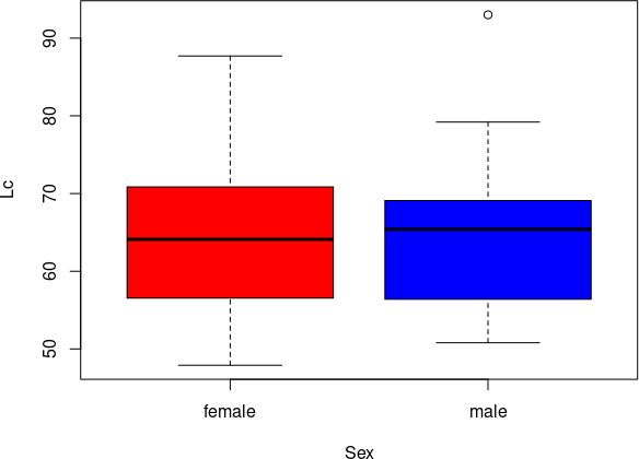
opar <- par(no.readonly=TRUE)
par(fig=c(0, 0.8, 0, 0.8))
plot(Lc, Ltc, pch = 16, xlab = "Lc, довжина тіла, мм", ylab = "Ltc, ширина голови, мм")
par(fig=c(0, 0.8, 0.4, 1), new=TRUE)
boxplot(Lc, horizontal=TRUE, axes=FALSE)
par(fig=c(0.6, 1, 0, 0.8), new=TRUE)
boxplot(Ltc, axes=FALSE)
mtext("Поєднання діаграми розсіяння з діаграмами розмаху", side=3, outer=TRUE, line=-4)
Fig. 6.10.4. This diagram is built from three parts.
par(opar)First of all, let's pay attention to the use of the commands opar <- par(no.readonly=TRUE) and par(opar). The first saves the system's graphical settings that were valid at the time of execution of this command into an object named opar. In the next script fragment, these parameters can be changed arbitrarily; after its execution, the initial parameters will be restored. After the described saving of graphical parameters, three diagrams are constructed, each occupying only a part of the available space. How each part will be located is determined by the fig=c(x1, x2, y1, y2) parameter. The coordinates x1, y1 refer to the bottom-left corner of the diagram, and x2, y2 refer to the top-right. An object that would occupy the entire space could be specified (if it made sense) with the parameter fig(0, 1, 0, 1). In the case considered, the scatter plot has parameters fig=c(0, 0.8, 0, 0.8), the upper box plot (the one oriented horizontally) - fig=c(0, 0.8, 0.4, 1), and the right box plot - fig=c(0.6, 1, 0, 0.8). The box plots are built on top of the scatter plot, and this is indicated by the use of the new=TRUE parameter; the axes on the box plots are not drawn, and this is ensured by the axes=FALSE parameter. Note: the spaces where the three combined diagrams are built intersect! This can be seen in the diagram. Why this intersection? It helps to remove the margins that R automatically adds to the box plots. How to determine how much the individual parts of the overall image should intersect? By trial and error! By the way, in the example used to create this illustration, slightly different boundaries were used; implementing this idea with our example, we chose different, more suitable boundaries for our case. Fig. 6.10.5. The diagram shown in Fig. 6.10.4 is overlaid on a diagram showing how the space is divided. Illustrations like the one in Fig. 6.10.4 carry a lot of information and can be used in modern scientific research. // add bootstrap table styles to pandoc tables function bootstrapStylePandocTables() { $('tr.odd').parent('tbody').parent('table').addClass('table table-condensed'); } $(document).ready(function () { bootstrapStylePandocTables(); }); $(document).ready(function () { window.buildTabsets("TOC"); }); $(document).ready(function () { $('.tabset-dropdown > .nav-tabs > li').click(function () { $(this).parent().toggleClass('nav-tabs-open'); }); }); (function () { var script = document.createElement("script"); script.type = "text/javascript"; script.src = "https://mathjax.rstudio.com/latest/MathJax.js?config=TeX-AMS-MML_HTMLorMML"; document.getElementsByTagName("head")[0].appendChild(script); })(); 6.11 Example of a non-trivial diagram using the plot() command To demonstrate the capabilities of the plot() command, we will use a database on the diversity of green toads described in section 2.3. Section 9.13 describes a comparison of females and males of toads from this database across all features. Here we will only show the construction of a diagram that visualizes the results of such a comparison. This is a so-called "Volcano Plot": an ordination of features used to compare certain groups in the space of "differences between groups - statistical significance of differences". Here is the full script for analysis and diagram construction. The wordcloud library is used to automatically "spread out" labels on the diagram using the textplot() command (without this, such labels overlap significantly). The provided script reads the file Bufotis_viridis_database_new.RData, which contains the BV database. It then creates a results_df dataframe to collect analysis results. In the for() loop, features are processed one by one, for which the significance of differences is determined using the non-parametric Wilcoxon test (section 9.9), and the distance of average values for all features between females and males is calculated. Factor features are converted into numerical features in this loop (this is quite acceptable for using the Wilcoxon test). After the results dataframe is filled, the Holm-Bonferroni correction for multiple comparisons (section 9.12) is applied to the set of p-level values. Then, the last step remains: constructing the diagram.
rm(list = ls())
# install.packages("wordcloud")
library(wordcloud)
## Loading required package: RColorBrewer
load("Bufotis_viridis_database_new.RData")
characters <- colnames(BV)[7:119] # Перелік ознак, за якими відбувається порівняння
results_df <- data.frame( # Датафрейм для збору результатів
  Feature = characters,
  p_raw = NA,
  diff = NA,
  stringsAsFactors = FALSE )
for(i in 1:length(characters)) { # Цикл перебирає усі ознаки
  ii <- i + 6 # Номер ознаки у датафреймі, перші 6 ознак не аналізуються
  val <- BV[[ii]] # Ознака, що аналізується
  ch <- if(is.factor(val)) as.numeric(as.character(val)) else val # Якщо ознака є фактором, її значення переводяться у числовий вигляд
  temp_df <- data.frame(ch = ch, Sex = BV$Sex) # Тимчасовий фрейм без NA для поточної ознаки
  temp_df <- na.omit(temp_df)
  if(length(unique(temp_df$Sex)) == 2 && length(unique(temp_df$ch)) > 1) { # Перевірка наявності даних для обох статей
   results_df$p_raw[i] <- wilcox.test(ch ~ Sex, data = temp_df)$p.value # Результати тесту Вілкоксона додаються до результатів
    means <- aggregate(ch ~ Sex, data = temp_df, FUN = mean) # Розрахунок середніх значень залежно від статі
    if(nrow(means) == 2) { # "Female" та "Male" за алфавітом, index 1 = Female, index 2 = Male
          results_df$diff[i] <- means[means$Sex == "Female", 2] - means[means$Sex == "Male", 2] } }  }
results_df$p_corr <- p.adjust(results_df$p_raw, method = "holm") # До результатів додається відкореговані за Хольмом-Бонферроні значення p-levels
results_df <- na.omit(results_df) # Видалення ознаки, де тест не проведено і лишилося NA
results_df$color <- "grey" # Кольори для результатів; сірий за умовчанням...
results_df$color[results_df$p_raw < 0.05] <- "cyan" # ...блакитні для тих, що були "значущими" до застосування поправки Хольма-Бонферроні..
results_df$color[results_df$p_corr < 0.05] <- "orange" # ...і помаранчові для значущих з врахуванням поправки на множинні порівняння
plot(results_df$diff, -log10(results_df$p_raw), # Діаграма
     col = results_df$color,
     pch = 19,
     xlab = "Різниця (Female - Male)",
     ylab = "Статистична значущість: -log10(p-value)",
     main = "Volcano Plot: Статевий диморфізм Bufotis viridis")
abline(h = -log10(0.05), col = "blue", lty = 2) # Альфа-значення: 0.05
top_indices <- order(results_df$p_raw)[1:42] # 30 ознак з найвищою значущістю, щоб іх підписати
textplot(results_df$diff[top_indices], # Застосування ibrary wordcloud щоб дещо розсунути підписи
         -log10(results_df$p_raw)[top_indices],
         words = results_df$Feature[top_indices],
         new = FALSE, # Малювати поверх існуючого графіка
         cex = 0.9)
Fig. 6.11.1. Result of executing the script: Volcano Plot