Biostatistics — 03. Topic 3. Data Visualization (using results of green frog descriptions as an example)
The first (and sometimes even the only, because it answers all questions) result of data processing is plotting graphs, i.e., visualizing results. This section demonstrates it using frog morphology data.
← D.A. Shabanov, M.A. Kravchenko.
Statistical analysis of data in zoology and ecology → Topic 2.
Using the Statistica program Topic 3.
Data visualization (using the example of green frog description results) Topic 3 (continued).
Working with graphs Biostatistics-02 Biostatistics-03 Biostatistics-04 Topic 3.
Data visualization (using the example of green frog description results) 3.1.
Histograms in Statistica: example of graph construction Studying the diversity of data presented in a table is easier using the simplest type of graph: histograms.
They are accessed from the Grafs menu and are located both at the very top of the drop-down list and can be called from more "deep" menus.
Fig.
3.1.1.
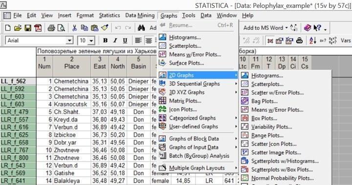
The histogram plotting mode can be invoked directly from the "Graphics" menu, and from the submenu of two-dimensional graphs, which provides a wider choice of options. Histograms show the frequencies of objects belonging to different classes in the form of columns. For example, an important characteristic by which the frogs described in the file can be grouped is their genotype. Let's build the distribution of frogs by genotypes. Following the path Grafs / Histograms... or, what is the same, Grafs / 2D Grafs / Histograms..., we enter the "quick" histogram plotting dialog.
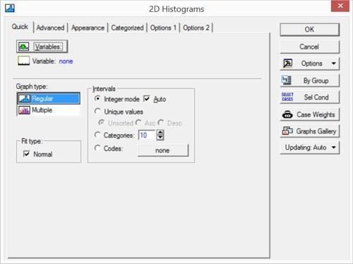
Fig. 3.1.2. Quick histogram plotting dialog Clicking the Variables button, we select the Genotype variable there. In this tab, you can also select multiple variables (and, in the simplest case, build several graphs simultaneously). To select variables that are not next to each other, hold down the Ctrl key while selecting. The checkbox next to the Fit type: Normal option will overlay a normal distribution curve on the graph. In this case, this is not needed at all, so this checkbox should be unchecked. It is also correct to uncheck the Auto checkbox, which ensures automatic splitting of the range of values for the Genotype variable (although in this case it will not affect the result: this variable always takes only values 1, 2, 3, 4, and 5). Fig.
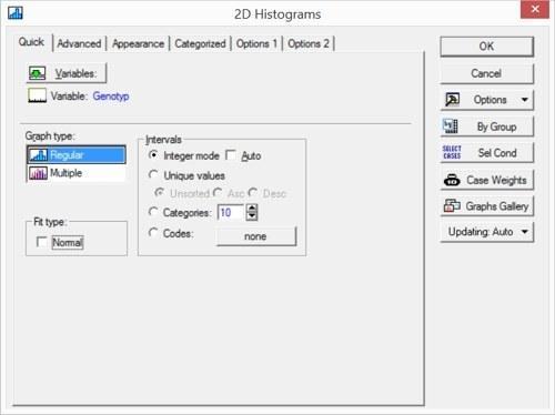
3.1.3. Quick histogram plotting dialog: necessary adjustments made The Advanced tab provides more extensive options for controlling histogram properties.
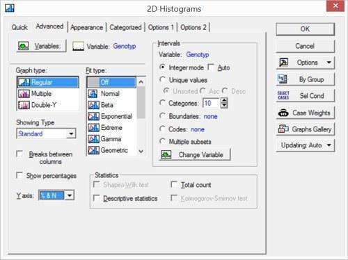
Fig. 3.1.4. "Advanced" tab in the histogram plotting dialog Let's change the Y-axis display mode: specify the "% & N" option there, so that we can see the distribution of frogs by genotypes not only by count but also in percentages of the total number. Clicking the "OK" button gives the result.
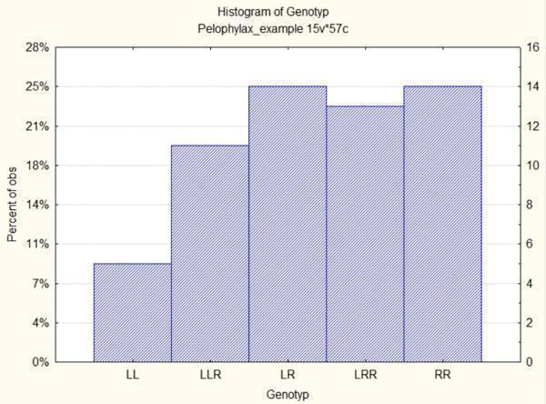
Fig. 3.1.5. Distribution of frogs from the Pelophylax_example.sta file by genotypes The second most important characteristic of the studied material is sex. Can we build a corresponding graph only for females?
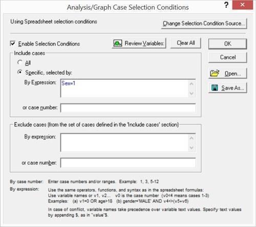
To do this, you need to click the Select Cases button. In Fig. 3.2.4, it is visible in the middle of the right row of buttons. Fig. 3.1.6. Select Cases dialog Immediately after calling this window, the vast majority of its options are closed for editing; to enable them, you need to check the box next to Enable Selection Condition. If, when performing an analysis, the user does not pay attention to the fact that the "Select Cases" button is pressed, they will not realize that they are working not with the entire set of their data, but only with a part of it. The next figure shows the dialog for selecting a statistical data processing method in the Basic Statistic and Tables mode; it can be assumed that after building the graphs, the user moved on to the actual statistical processing. If they do not pay attention to the fact that the "Select Cases" button is pressed, it may turn out that part of the results available in the file is inaccessible to them. Fig.
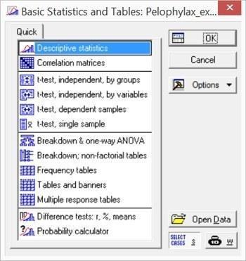
3.1.7. Attention! The "Select Cases" button is pressed! If these selection conditions remain active after previous actions with the Statistica program, part of the data may be inaccessible for processing! Observation selection conditions can be set in several different ways. You can enter conditions for including observations in the analysis (the rows for which this condition is met will be analyzed, and all others will not). Conversely, you can enter conditions for excluding observations from the analysis. Finally, both included and excluded observations can be specified by simple enumeration. When formulating conditions, you can use variable names, or their ordinal numbers; the use of and and or functions (and, or), as well as parentheses, is allowed. For example, the condition "Basin=2 and v5=1 and (v7=3 or v7=4)" corresponds to a single individual in the Pelophylax_example.sta file. Thus, by specifying the condition Sex=1, we will build a histogram only for females. Additionally, add a checkmark in the Breaks between columns box in the Advanced tab to prevent wide and low columns from merging. Fig.
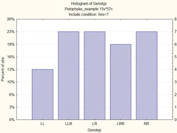
3.1.8. This histogram shows only female frogs To see the distribution of males, you can build another histogram, or you can combine data on females and males on one graph. To do this, you need to use Categorized Histograms from the Categorized Grafs menu. Fig.
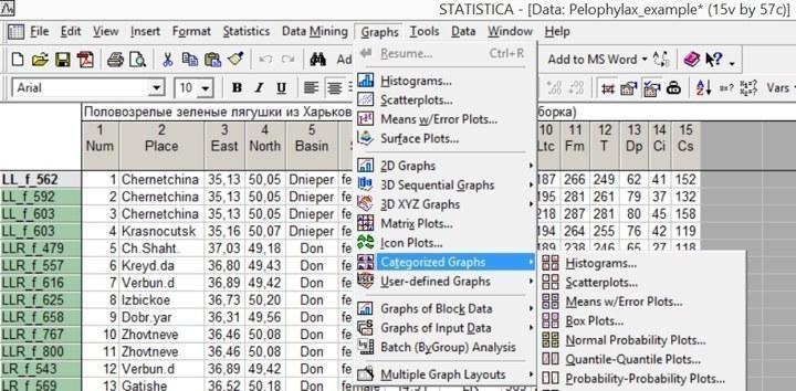
3.1.9. Categorized Histograms are a separate group in the Grafs menu When selecting variables in categorized histograms, you need to select not only the variable whose diversity will be shown by columns, but also the categorizing variable. Fig.
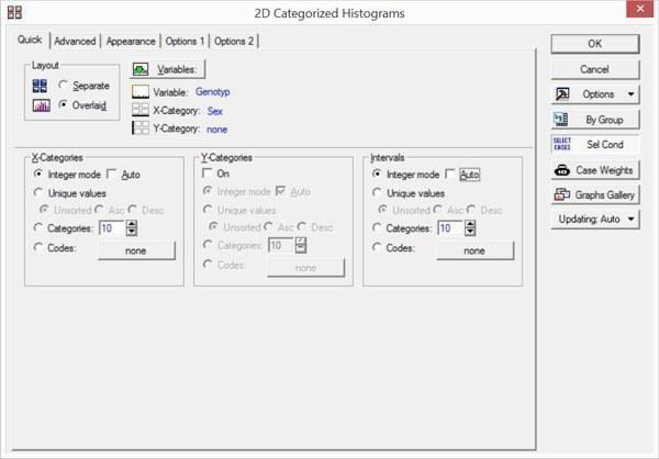
3.1.10. Setting parameters for categorized histograms. Note the Layout switch: Separate or Overlaid When selecting Overlaid placement, differences in the categorizing variable are shown on categorized graphs by the formatting of the corresponding symbols. You can select two variables for categorization, but in most cases, such graphs turn out to be overloaded with details and are difficult to interpret. Fig. 3.1.11.
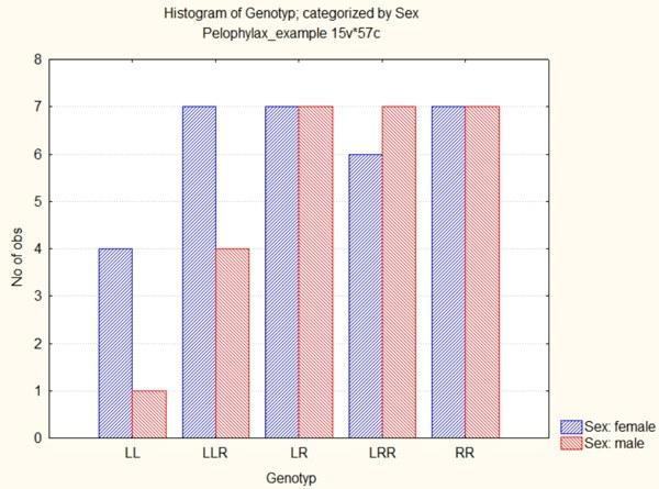
Categorized histogram: males and females are shown by separate columns highlighted in color