Biostatistics — 04. Topic 3 (continuation). Work with Graphs
In order to use statistical charts in presentations or publications, they must be appropriately prepared. When constructing certain types of charts, statistical data processing occurs. For example, this applies to the calculation of regression lines when constructing scatter plots.
3.2. Editing a Graph in Statistica
The categorized histogram obtained in the previous section allows for quick estimation of sample size. However, this graph has several significant disadvantages.
For example, in the collective unconscious, blue is associated with the male sex, while red or pink is associated with the female sex (hence blue blankets for baby boys and red ones for girls, as well as the slang terms "blue" and "pink" for sexual minorities). In the previous graph, females are shown in blue and males in red. This discrepancy should be corrected.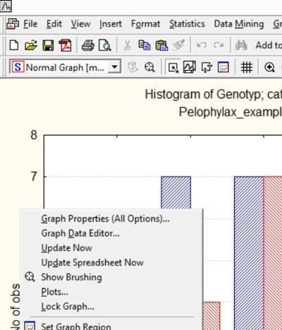
Fig. 3.2.1. Right-clicking on the field next to the graph calls up a context menu, one of whose options, Graph Properties (All Options)..., allows changing its properties within wide limits
The colors of graph elements, like many other properties, can be changed using the graph properties editor. To call it up, right-click on the graph field (outside the actual drawing) and select Graph Properties (All Options)...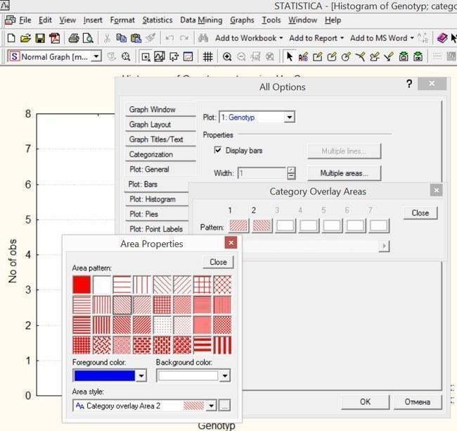
Fig. 3.2.2. In the All Options window, on the Plot: Bars tab, click the Multiple areas button. A list of column styles will appear. Clicking on any of them will allow changing its fill pattern and color. The figure shows the stage at which the first column has already been made red, and for the second column the color is being changed to blue...
Many tabs are available in this mode. In our case, we need to change the properties of the graph columns. In the corresponding dialog, you can change the pattern color, background, and drawing pattern. If you need to produce a graph using this program that will be used for black-and-white printing, you should remove all color diversity and convey the features of different elements only through different hatching, line shapes, textures, etc.
In different versions of the Statistica program, the arrangement of buttons in the All Options tab turns out to be different. Those who are just learning to work with the program can experiment with different buttons and modes to find out what functions are available to the user.
Statistica graphs have their own format and the extension ".stg". Most other programs cannot read this format. However, most Windows programs can work with the ".wmf" format (Windows metafile). By first saving the graph in ".stg" format (so that you can return to it at any time and edit it using Statistica tools), and then in ".wmf" format, you can place it in the text of Microsoft Word or other text editors, as well as CorelDraw! and other vector graphics programs. Of course, most Windows programs also have the ability to simply transfer Statistica graphs and table fragments via the clipboard.
When saving in ".wmf" format, each individual element of the drawing is saved separately. Dashed lines that show levels marked by scale divisions turn into a set of many points or segments that can take very long to process by appropriate programs (for example, CorelDraw!). Therefore, sometimes it makes sense to convert dashed lines to continuous ones. To do this, simply double-click on such a line, double-click on the Gridlines... button, and set the required line parameters.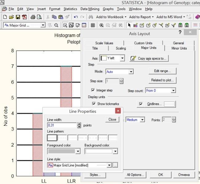
Fig. 3.2.3. After double-clicking on the Gridlines... button, line parameters became available, which by default are displayed in italic
Although in the case of the graph under consideration there is no urgent need for such a change, you can change the range of the displayed scale and the distance between division lines. To change the interval between tick marks, you can use the Scaling or Major Units tabs. To edit the intervals between grid lines, select the Manual option in the Mode window. Suppose we choose a step of 3 units here.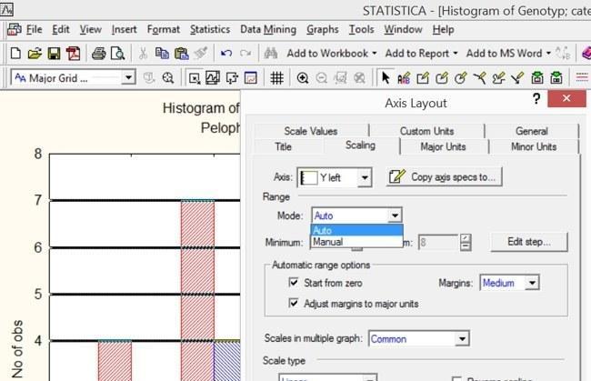
Fig. 3.2.4. By switching the mode from "Auto" to "Manual" in this window, you can set values for the beginning and end of the scale displayed on the graph
In the manual mode tab, we set the scale minimum to 0 and the maximum to 9. In the Edit step... window, you can also switch to manual mode and set the distance between lines to 3 units.
Double-clicking on the axis label, graph title, or legend (explanation of symbols) calls up the editing mode for these elements. Here you can give the graph a more appropriate title. Double-clicking on the axis name allows you to change it as well.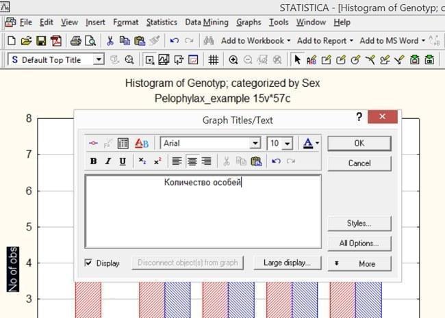
Fig. 3.2.5. For the graph to be well perceived, it is important to clearly and correctly label the coordinate axes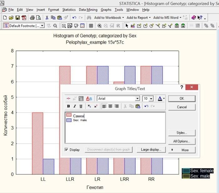
Fig. 3.2.6. Editing the "legend" (list of graph symbols)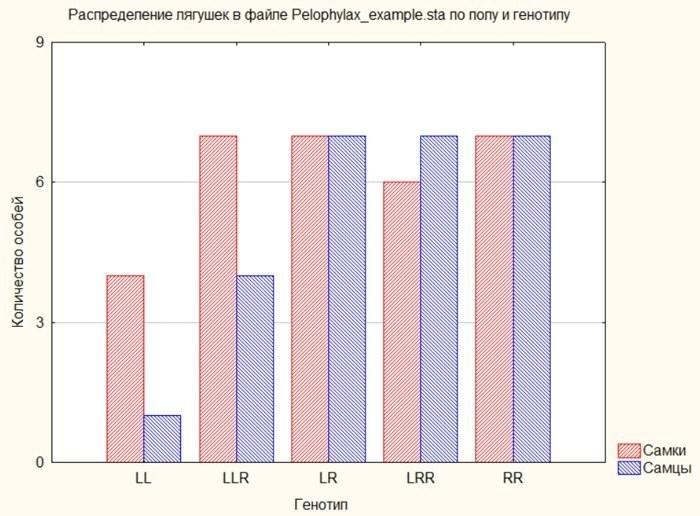
Fig. 3.2.7. The result of the graph modifications, the steps of which are shown in the previous illustrations
3.3. Scatterplots and Regression Lines in Statistica
One of the most powerful ways to construct graphs in Statistica is scatterplots (Scatterplots). Calling up the dialog for their construction is very simple: Graphs / Scatterplots or Graphs / 2D Graphs / Scatterplots. A whole set of techniques for working with such graphs has already been discussed during the discussion of working with histograms.
Let us start with something simple: let us construct a graph of the dependence of frog head width on their body length. For this, the X-axis should reflect the values of trait L, and the Y-axis — the values of trait Ltc.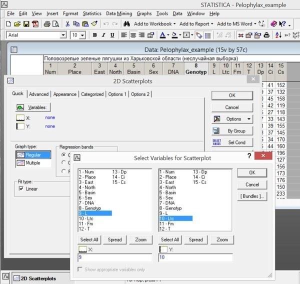
Fig. 3.3.1. Constructing a graph of the dependence of head width on body length
Note: the graph title will include the regression equation describing the used set of points.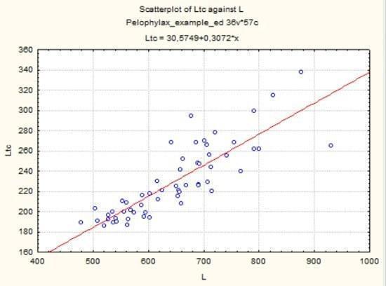
Fig. 3.3.2. The graph constructed according to the conditions shown in the previous figure
The term "regression" was introduced by Francis Galton, the founder of biometrics, back in the late 19th century. Functional dependence describes a unambiguous relationship of one quantity to another; for example, the weight of a ball of given density is a function of its size. Regression describes a statistical dependence. A person's weight depends on their height, but it also depends on many other factors. The dependence of a person's height on weight is not a function, but a regression. Regression is the dependence of the average value of some quantity on another (or others).
When constructing a scatterplot, a certain set of points is considered. The user sets the nature of the function describing the relationship of the average values of the quantities under consideration. Note: in Fig. 3.4.1 it can be seen that in the Fit type: Linear box (in the right part of the dialog window) there is a checkmark. When constructing a graph under such conditions, the program determines such coefficients of linear dependence that allow the best approximation of the available data set. Approximation is an approach; to approximate is to describe approximately; to replace an unknown dependence with its most suitable approximation.
As you can see in Fig. 3.4.2, the graph reflects the dependence Ltc = 30.6 + 0.3*L (the x-axis corresponds to variable L). This function corresponds to linear dependence: y = a + b*x. In the Advanced tab, you can select other functions for approximating the dependence reflected in the arrangement of points on the graph.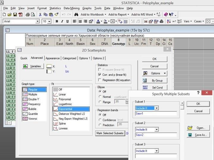
Fig. 3.3.3. Some capabilities of the Advanced tab of the scatterplot construction dialog
Note the capabilities of the Advanced tab reflected in Fig. 3.4.3. The fit function (Fit) selected for approximating the dependence between variables based on the available set of points is exponential (Exponential), y = a*ex, where e is the base of natural logarithms. In the Statistics box, a checkmark is placed next to the option Corr. and p (linear fit) — the correlation coefficient and its level of statistical significance (for linear dependence). In the Mark Selected Subsets box, special designations are indicated for females (Sex=1) and males (Sex=2).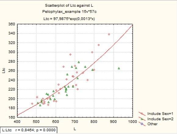
Fig. 3.3.4. The graph constructed according to the conditions shown in the previous figure
As you can see, in the inset in the corner of the graph, data on the Pearson correlation coefficient (r) and its level of statistical significance (p) have appeared.
Compare the result in Fig. 3.4.4 with the following one, constructed using a categorized scatterplot (Graphs / Categorized Graphs / Scatterplots), in the Overlaid mode.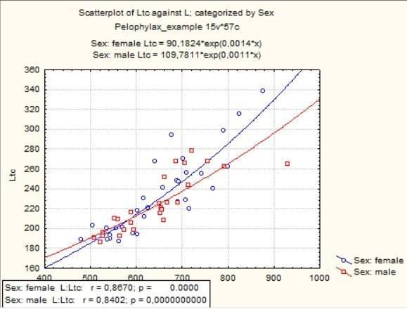
Fig. 3.3.5. Categorized scatterplot: two approximation lines instead of one
As you can see, the difference is that in the Mark Selected Subsets mode, all calculations (both regression lines and correlations) are performed for the entire population as a whole, and the two sexes are only marked with different symbols, whereas in the categorized scatterplot, all calculations are performed for both sexes separately.