
Ecology: the Science of Interactions. IV-03. Demographic Tables, Pyramids, and Survival Curves
Demographic tables provide material for constructing survival curves. Such a method of graphical representation of the dependence of the proportion of individuals remaining alive on their age was proposed by Robert Pearl in the 1920s. He distinguished three main types of survival curves
IV-3. Demographic Tables, Pyramids, and Survival Curves
As we have already noted, the most important static characteristics of a population are its sex structure (the ratio of individuals of different sexes) and age structure (the ratio of individuals of different ages). These parameters are conventionally described using demographic tables. The first such table was constructed by the founder of demography, John Graunt, in the 17th century based on mortality data for London residents, which church parishes collected in order to promptly detect the onset of plague epidemics.
Demographic tables are convenient for observing the dynamics of birth and mortality rates in different age and (or) sex groups. One method for constructing them (Table IV-3.1) involves observing the fate of a particular group of individuals (a cohort) born within a short time interval and recording the age at death of all cohort members.
Table IV-3.1. Demographic Table of the Population of the Acorn Barnacle (Balanus glandula)—a Representative of the Barnacles (Cirripedia) (Connell, 1970, after Hilyarov, 1990)
|
Proportion of individuals surviving to the beginning of the age interval |
Number of living individuals at the time of census |
Proportion of individuals surviving to the beginning of the age interval |
Number of individuals that died during the interval |
0 |
Expected lifespan of those individuals who survived to this age, years |
|
0 |
142 |
1000 |
80 |
0,563 |
1,58 |
|
1 |
62 |
0,437 |
28 |
0,452 |
1,97 |
|
2 |
34 |
0,239 |
14 |
0,412 |
2,18 |
|
3 |
20 |
0,141 |
4,5 |
0,225 |
2,35 |
|
4 |
15,5* |
0,109 |
4,5 |
0,290 |
1,89 |
|
5 |
11 |
0,077 |
4,5 |
0,409 |
1,45 |
|
6 |
6,5* |
0,046 |
4,5 |
0,692 |
1,12 |
|
7 |
2 |
0,014 |
0 |
0,000 |
1,50 |
|
8 |
2 |
0,014 |
2 |
1,000 |
0,50 |
|
9 |
0 |
0,0 |
- |
- |
- |
IV-3. Demographic Tables, Pyramids, and Survival Curves
As we have already noted, the most important static characteristics of a population are its sex structure (the ratio of individuals of different sexes) and age structure (the ratio of individuals of different ages). These parameters are conventionally described using demographic tables. The first such table was constructed by the founder of demography, John Graunt, in the 17th century based on mortality data for London residents, which church parishes collected in order to promptly detect the onset of plague epidemics.
Demographic tables are convenient for observing the dynamics of birth and mortality rates in different age and (or) sex groups. One method for constructing them (Table IV-3.1) involves observing the fate of a particular group of individuals (a cohort) born within a short time interval and recording the age at death of all cohort members.
Table IV-3.1. Demographic Table of the Population of the Acorn Barnacle (Balanus glandula)—a Representative of the Barnacles (Cirripedia) (Connell, 1970, after Hilyarov, 1990)
|
Number of deaths in each age group |
Mortality per 1,000 persons |
0‑1 |
Mortality per 1000 individuals |
|
0-1 |
173 400 |
1 651 |
9,52 |
|
1-4 |
685 900 |
340 |
0,5 |
|
5-9 |
876 600 |
218 |
0,25 |
|
10-14 |
980 300 |
234 |
0,24 |
|
15-19 |
1 164 100 |
568 |
0,49 |
|
20-24 |
1 136 100 |
619 |
0,54 |
|
25-29 |
1 029 300 |
578 |
0,56 |
|
30-34 |
933 000 |
662 |
0,71 |
|
35-39 |
739 200 |
818 |
1,11 |
|
40-44 |
627 000 |
1 039 |
1,66 |
|
45-49 |
622 400 |
1 664 |
2,67 |
|
50-54 |
615 100 |
2 574 |
4,18 |
|
55-59 |
596 000 |
3 878 |
6,51 |
|
60-64 |
481 200 |
4 853 |
10,09 |
|
65-69 |
413 400 |
6 803 |
16,07 |
|
70-74 |
325 600 |
8 421 |
25,86 |
|
75-79 |
235 100 |
10 029 |
42,66 |
|
80-84 |
149 300 |
10 824 |
72,5 |
|
85 and older |
119 200 |
18 085 |
151,7 |
Demographic tables can be simpler, containing only the number of individuals in certain age-sex categories. Demographic pyramids are constructed based on demographic tables. Age intervals are plotted on the vertical axis, and the number of males (in the case of human pyramids - men) is plotted on the left as a bar chart, and the number of females is plotted on the right. This makes the difference in mortality in different age categories and sexes apparent. For example, data for constructing the demographic pyramid of Ukraine are given in Table IV-3.3. ( source ). Table IV-3.3. Demographic table of the population of Ukraine as of January 1, 2016 (excluding territories occupied by Russia and terrorist organizations supported by Russia).
|
Women |
Men |
Women |
Women |
Men |
Women |
|
|
0 |
211 339 |
197 833 |
51 |
268 174 |
312 280 |
|
|
1 |
238 053 |
224 436 |
52 |
282 787 |
334 969 |
|
|
2 |
242 884 |
228 566 |
53 |
286 276 |
343 840 |
|
|
3 |
251 286 |
236 070 |
54 |
295 213 |
356 263 |
|
|
4 |
242 525 |
228 012 |
55 |
302 282 |
369 718 |
|
|
5 |
239 790 |
225 895 |
56 |
283 130 |
354 777 |
|
|
6 |
247 658 |
232 081 |
57 |
276 830 |
352 682 |
|
|
7 |
246 292 |
231 359 |
58 |
260 318 |
338 471 |
|
|
8 |
226 677 |
214 535 |
59 |
254 431 |
337 497 |
|
|
9 |
220 970 |
210 041 |
60 |
232 462 |
315 462 |
|
|
10 |
205 415 |
193 481 |
61 |
233 782 |
324 457 |
|
|
11 |
205 494 |
194 605 |
62 |
208 379 |
296 363 |
|
|
12 |
196 088 |
185 961 |
63 |
212 821 |
309 520 |
|
|
13 |
188 378 |
177 020 |
64 |
208 929 |
306 173 |
|
|
14 |
180 933 |
170 616 |
65 |
202 140 |
302 258 |
|
|
15 |
186 068 |
175 950 |
66 |
201 406 |
312 895 |
|
|
16 |
188 132 |
178 596 |
67 |
164 310 |
259 283 |
|
|
17 |
199 667 |
191 300 |
68 |
140 031 |
229 249 |
|
|
18 |
209 887 |
199 416 |
69 |
129 849 |
222 131 |
|
|
19 |
228 717 |
216 345 |
70 |
81 538 |
146 446 |
|
|
20 |
239 365 |
225 479 |
71 |
89 398 |
168 292 |
|
|
21 |
249 004 |
234 132 |
72 |
77 468 |
149 507 |
|
|
22 |
262 351 |
248 210 |
73 |
95 195 |
189 839 |
|
|
23 |
281 119 |
266 380 |
74 |
122 876 |
245 425 |
|
|
24 |
299 627 |
284 254 |
75 |
119 964 |
245 102 |
|
|
25 |
313 751 |
298 618 |
76 |
118 369 |
258 565 |
|
|
26 |
326 933 |
312 701 |
77 |
116 399 |
261 038 |
|
|
27 |
346 300 |
332 604 |
78 |
113 614 |
254 250 |
|
|
28 |
357 229 |
343 228 |
79 |
87 444 |
195 204 |
|
|
29 |
377 924 |
365 398 |
80 |
66 546 |
151 397 |
|
|
30 |
365 389 |
355 317 |
81 |
46 057 |
105 479 |
|
|
31 |
373 599 |
363 325 |
82 |
35 102 |
84 951 |
|
|
32 |
377 596 |
368 473 |
83 |
39 273 |
103 169 |
|
|
33 |
343 652 |
334 841 |
84 |
37 704 |
97 200 |
|
|
34 |
329 211 |
327 713 |
85 |
41 419 |
110 758 |
|
|
35 |
336 112 |
334 930 |
86 |
27 468 |
84 095 |
|
|
36 |
316 073 |
316 770 |
87 |
25 154 |
80 296 |
|
|
37 |
311 492 |
316 567 |
88 |
20 900 |
63 381 |
|
|
38 |
299 213 |
307 561 |
89 |
15 911 |
52 720 |
|
|
39 |
314 648 |
324 098 |
90 |
11 919 |
41 260 |
|
|
40 |
305 622 |
319 800 |
91 |
8 390 |
31 390 |
|
|
41 |
296 250 |
312 008 |
92 |
5 399 |
19 405 |
|
|
42 |
288 153 |
304 467 |
93 |
3 881 |
13 776 |
|
|
43 |
295 105 |
315 155 |
94 |
3 580 |
10 578 |
|
|
44 |
292 515 |
311 807 |
95 |
3 562 |
9 192 |
|
|
45 |
288 882 |
309 322 |
96 |
1 038 |
2 675 |
|
|
46 |
262 769 |
286 474 |
97 |
998 |
2 995 |
|
|
47 |
265 315 |
291 439 |
98 |
859 |
1 852 |
|
|
48 |
259 160 |
289 260 |
99 |
345 |
821 |
|
|
49 |
264 886 |
298 893 |
50 |
1 848 |
||
|
50 |
259 215 |
297 676 |
Demographic tables can also be simpler, containing only the numbers of certain sex-age categories. Demographic pyramids are constructed based on demographic tables. Age intervals are plotted on the vertical scale; on the left side, in the form of a bar chart—the number of males (in the case of human pyramids—men), and on the right—females (women). This makes the difference in mortality between different age categories and different sexes clearly visible. For example, data for constructing the demographic pyramid of Ukraine are presented in Table IV-3.3. (source).
Table IV-3.3. Demographic Table of the Population of Ukraine as of January 1, 2016 (without the territories occupied by Russia and terrorist organizations supported by Russia)
Demographic pyramids help to vividly imagine the history of a population. Consider such a pyramid for the population of Ukraine (Fig. IV-3.1). You can see, for example, how it reflects the decline in birth rates during World World II. The "echo" of these events manifested even after a generation and, to a lesser extent, after two generations, when the distant consequences of the war were compounded by a decline in the standard of living associated with incompetent governance of Ukraine in the first (unfortunately, not only the first) years of its independence. The number of people who by their age are children and grandchildren of those born during the war turns out to be smaller than the number of those in nearby age groups. The decline in the number of newborns is, probably, a consequence of Russia's aggression and the deterioration of the country's economic situation.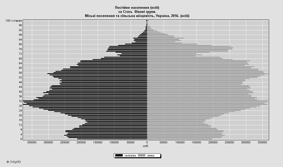
Fig. IV-3.1. Demographic Pyramid of the Population of Ukraine (without occupied territories) as of 2016 (based on data from Table 4.3.3)
Furthermore, demographic tables provide material for constructing survival curves. This method of graphical representation of the dependence of the proportion of individuals remaining alive on their age was proposed in the 1920s by Robert Pearl. He distinguished three main types of survival curves (Fig. IV-3.2).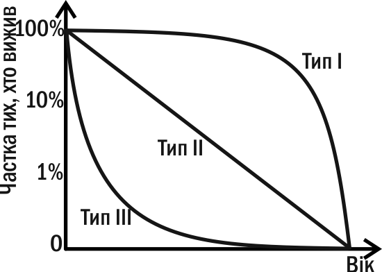
Fig. IV-3.2. Three Types of "Ideal" Mortality Curves according to Pearl
Curve Type I (Drosophila type) has a convex form. It describes a situation when high mortality is observed at mature age. This is characteristic of Drosophila, mayflies, and other insects that soon after emerging from the pupa leave offspring and die. The survival curves of large mammals approximate Curve Type I. Curve Type II (Hydra type) is characteristic of organisms with uniform mortality at any age. On the graph, this corresponds to a straight line. Such curve types are characteristic of fish, reptiles, birds, herbaceous perennial plants, etc., with the sole caveat that the count is made from organisms that have already passed the most vulnerable stages of their development. Curve Type III (oyster type) has a concave form. It is characteristic of organisms that mainly die at the early stages of their life. Oysters lead a sessile lifestyle as adults, while their larvae are planktonic. It is during this period that they are most vulnerable. For individuals that successfully pass the larval stage, the chance of survival greatly increases. This type of survival curve is characteristic of many animals with high fecundity and no parental care.
Real survival curves are a combination of these types. The human curve is convex, relatively close to the first type, but can have different forms in different cases (Fig. IV-3.3).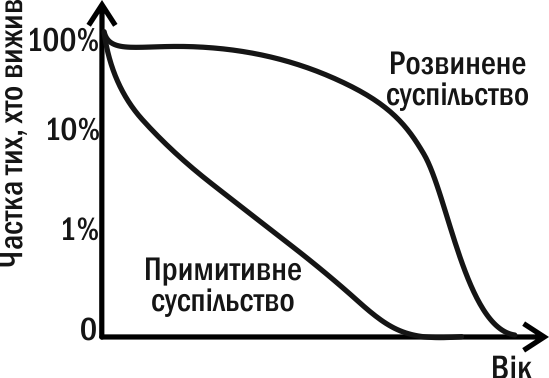
Fig. IV-3.3. Types of Survival Curves in Primitive and Developed Society